Style with CSS
You can use a Cascading Style Sheet (CSS) to apply your corporate style to Paligo's HTML and HTML5 outputs. A CSS is a list of instructions that tell the browser how to style the HTML elements on the page. For example, it can tell a browser to display headings in blue and to use a sans-serif font for body text.
You do not style the Paligo XML that you see in the Paligo editor and you do not need to map its elements to HTML either. Paligo handles that automatically, see What Happens during Publish?
The layout that you use to publish also has settings that affect your published HTML, see Layouts. You can make your preview use your custom layout, see Set Preview Layouts.
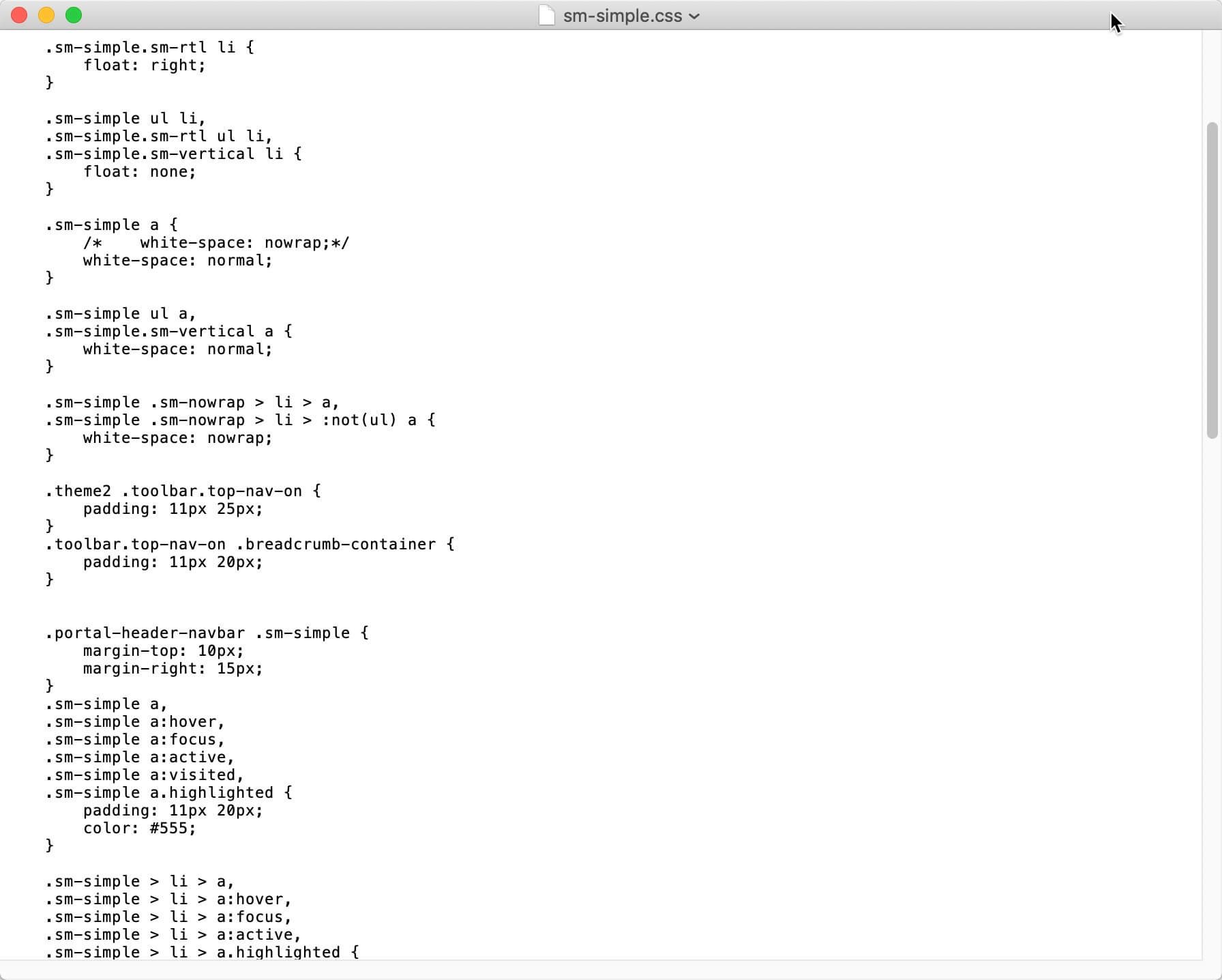 |
Example of a CSS stylesheet
To write your custom CSS, you will need:
-
A Third-Party code editor or text editor that is capable of saving as
.css. You will use it to Create a CSS File. -
At least basic CSS knowledge. If your organization has web designers, you may be able to leave the CSS customization to them, as they will already have good CSS knowledge. To learn about CSS, this CSS Tutorial covers the basics and has links to more resources.
-
An understanding of Browser Inspection Tool. This is a feature of most modern browsers that lets you see the underlying HTML and also test CSS changes.
Tip
To help you get started, we have an Branding HTML Tutorial. It will guide you through using CSS to change the look and feel of the article pages in your help center.
Alternatively, if you are already familiar with CSS, you may find the following sections useful:
This HTML5 branding tutorial is designed to teach you the basics of using CSS and a Layout's settings to customize the look and feel of an HTML5 Help Center. For the tutorial, we are focusing on an article page in a Help Center, but you can use the same principles to customize other pages.
The tutorial is not a comprehensive guide to customizing every part of an HTML5 Help Center. Also, while we explain some CSS basics, it is not a guide to using CSS.


HTML5 Help Center article with default styling (left) and with customized styling (right)
To complete the tutorial, you need:
-
Paligo instance with full author license.
-
A logo image file for your organization.
-
A code editor or text editor that can save CSS files, such as Atom, Notepad ++, BBEdit, Brackets, VisualStudio Code. (Other editors are available).
-
A modern browser, such as Google Chrome or Mozilla FireFox.
-
A basic understanding of the browser's Inspection Tool, see Browser Inspection Tool.
We also expect you to understand the basics of creating content in Paligo, including how to:
-
Create publications and topics
-
Add topics to a publication
-
Create paragraphs, tables, lists, procedures, subsections (sections inside another section)
-
Add images to a topic.
During the branding HTML5 Help Center tutorial, you will learn how to customize the look and feel of a regular article page in an HTML5 Help Center. This involves:
-
Using a browser's Inspection tool to view the HTML and test changes to the CSS
-
Using different selectors and rules in CSS
-
Applying attributes to elements in Paligo
-
Creating class names
-
Uploading a custom CSS to a Layout
-
Uploading a logo to a Layout.
Ready to get started? Let's begin with Prepare a Sample Topic and CSS.
Note
The tutorial only covers using CSS to style for a browser on a desktop. For mobile devices, you can use media queries in your CSS. There are many online resources for learning about media queries, such as w3schools.com.
First, let's create a topic with some sample content that you can style in the later stages of the tutorial. You will also add the topic to a publication.
-
Create a sample topic containing:
-
Title
-
Two paragraphs (para)
-
Procedure with some steps
-
Bullet list (unordered list)
-
Nested bullet list (a bullet list inside a list item in another "parent" bullet list).
-
Number list (ordered list)
-
Image
-
Table
Create a table that has 4 rows, 4 columns and a header. Enter some text or numbers in each cell.
-
A subsection
For the tutorial, use the Element Context Menu to add a
section,title, andparaelement into the topic directly. -
A subsection of the subsection
Use the Element Context menu to add a
section,title, andparaelement inside the previous section.
-
-
Select the second
paraelement and use the Element attributes panel to give it theroleattribute. Set the value of theroleattribute to:indentbody

When you publish, Paligo will give the paragraph the class name "indentbody" in the HTML. You can then style it using CSS.
-
Select the
tableelement and use the Element attributes panel to give it theroleattribute. Set the value of theroleattribute to:data-table

When you publish, Paligo will create a
divelement to contain the table. Thedivelement will have the class name "data-table" and you can style it by using CSS. -
Select the last cell in your table. In the Element Structure Menu at the top, select the
tdelement and then Go to element from the menu. Use the Element attributes panel to give thetdelement theclassattribute and set its value to:yellow-cell

When you publish, Paligo will give this cell the class name "yellow-cell". You can then style it using CSS.
Tip
When styling tables, always use the
roleattribute for thetable. Only use theclassattribute for individual rows or table cells. -
Save your sample topic.
-
Create a publication, add your sample topic to it, and then save it.
-
Select the dotted menu ( ... ) for your publication and then select Publish.
Publish your publication and use the built-in default HTML5 Help Center Layout.
-
Select HTML5 and choose the default HTML5 Help Center Layout.
-
Select Publish document.
Paligo publishes your publication and it downloads as a zip file in your browser.
-
Open the zip file and browse to the out folder. Open the index.html file in a browser. For this tutorial, we are using Google Chrome.
-
Select the panel for your sample topic to open it.
-
Create a CSS file. You can use any third-party text editor or code editor that supports saving a CSS file. Leave the editor open so that you can add CSS to it as you work through this tutorial.
Next: Style the TOC Sidebar.
Your sample topic should look similar to this:

If you select Edit and then < / >, you can see the source code of your sample page. It should look similar to the following XML. We have removed the xml ids and section attributes for clarity, as Paligo adds those automatically, but you may see them in your source code.
Source code:
<?xml version="1.0"?>
<section>
  <title>Sample Content</title>
  <para>This is a regular paragraph.</para>
  <para role="indentbody">This is an indented paragraph.</para>
  <procedure>
    <step>
      <para>This is step 1</para>
    </step>
    <step>
      <para>This is step 2.</para>
      <procedure>
        <step>
          <para>This is a nested step.</para>
        </step>
      </procedure>
    </step>
  </procedure>
  <itemizedlist>
    <listitem>
      <para>Itemized list (bullet list)</para>
    </listitem>
    <listitem>
      <para>Itemized list 2</para>
      <itemizedlist>
        <listitem>
          <para>Nested itemized list</para>
        </listitem>
      </itemizedlist>
    </listitem>
  </itemizedlist>
  <orderedlist>
    <listitem>
      <para>Ordered list</para>
    </listitem>
    <listitem>
      <para>Ordered list step 2</para>
      <orderedlist>
        <listitem>
          <para>This is a nested list item.</para>
        </listitem>
      </orderedlist>
    </listitem>
  </orderedlist>
  <mediaobject>
    <imageobject>
      <imagedata fileref="UUID-39efc9ab-ba22-da66-200c-b8324c2aabd2" width="25%"/>
    </imageobject>
  </mediaobject>
  <table class="data-table" frame="border" rules="all">
    <caption>table title</caption>
    <thead>
      <tr>
        <th>
          <para>Column A</para>
        </th>
        <th>
          <para>Column B</para>
        </th>
        <th>
          <para >Column C</para>
        </th>
        <th>
          <para>Column D</para>
        </th>
      </tr>
    </thead>
    <tbody>
      <tr class="green-row">
        <td>
          <para>1</para>
        </td>
        <td>
          <para>2</para>
        </td>
        <td>
          <para>3</para>
        </td>
        <td>
          <para>4</para>
        </td>
      </tr>
      <tr>
        <td>
          <para>5</para>
        </td>
        <td>
          <para>6</para>
        </td>
        <td>
          <para>7</para>
        </td>
        <td>
          <para>8</para>
        </td>
      </tr>
      <tr>
        <td>
          <para>9</para>
        </td>
        <td>
          <para>10</para>
        </td>
        <td>
          <para>11</para>
        </td>
        <td>
          <para>12</para>
        </td>
      </tr>
      <tr>
        <td>
          <para>13</para>
        </td>
        <td>
          <para>14</para>
        </td>
        <td>
          <para>15</para>
        </td>
        <td class="yellow-cell">
          <para>16</para>
        </td>
      </tr>
    </tbody>
  </table>
  <section>
    <title>Sub-section level 1</title>
    <para>Para in sub-section 1.</para>
    <section>
      <title>Sub-section level 2</title>
      <para>Para in sub-section level 2.</para>
    </section>
  </section>
</section>
The table of contents (TOC) is shown in a sidebar and has a blue background, by default. Let's change the color.
-
Right-click in the browser window and select Inspect*.
*This is correct for Google Chrome. Other browsers may use a different name.
-
Use the Inspect tool in the Browser Inspection Tool.

-
Move the cursor over the TOC sidebar so that the entire bar is highlighted and then left-click to select it.

-
In the Styles, find the rule that is setting the background color.

-
Select the color box and change the color to:
#a94442

The background color of the TOC changes in the browser.
-
Right-click on the rule that you changed in steps 4 and 5 and select Copy Rule.

-
Paste the rule into your CSS file (from Prepare a Sample Topic and CSS).
It is best practice to add comments to your CSS so that anyone who opens the CSS file can tell what each rule is styling. To start a comment, enter /* and to end a comment enter */
Here is an example of a comment before a rule:
/* The following rule changes the background color of the sidebar */

.bg-primary, .btn-primary, .pagination>.active>a,
.pagination>.active>span, .pagination>.active>a:hover,
.pagination>.active>span:hover, .pagination>.active>a:focus,
.pagination>.active>span:focus, .site-sidebar,
.portal-single-publication .publication-icon {
    background-color: #a94442;
}
Note
You could use the same technique to change the style for other elements in the TOC, such as the color of the text. We will not cover that in this tutorial.
We will cover changing the logo at a later stage, as this is a change you can make in the HTML5 layout.
Now let's change the color and style of the headings and paragraphs.
-
Use the Inspect tool in the Browser Inspection Tool to select the main heading on the page.

-
In Styles, find the rule that sets the heading 2 (h2) font-size and increase the size to 40px.

-
Click on the line below the font-size property and add a color property with the value set to #a94442. Remember to add a semi-colon at the end of the color value.

This sets the main heading to match the color of the TOC side bar.
-
Add another rule to the same class. This time set the font-weight to 800. Again, remember to add a semi-colon after the font-weight value.


-
Right-click on the rule in the Styles panel and select Copy rule.
-
Paste the rule into your CSS file, after the closing curly bracket of the previous rule.

-
Using the same technique, set your:
-
sub-headings to the same color as your main heading
.h3, h3 { font-size: 28px; color:#a94442; } .h4, h4 { font-size: 28px; color:#a94442; } -
paragraph to medium font-size
p {
    font-size: medium;
}
Note
This style applies to all paragraphs as the selector is
p. You will learn how to select a specific paragraph later in the tutorial. -
-
Copy and paste these rules into your CSS file.
Next: Style Procedure Numbers.
Now let's change the style of the procedure step numbers. We will change the background color to a dark red (#a94442).
-
Use the Selector tool in the Browser Inspection Tool to select a step in a procedure.
-
In the Styles, select the
::beforethat comes immediately after the selected<li class="step">. The::beforeis a pseudo element and, in this case, it represents the step number icon.
-
Change the background color:
.theme1 .procedure > li::before {
    background-color: #a94442;
}
-
Copy the rule and paste it into your CSS file.
Next: Style the Images.
Now let's apply some styling to bullet lists at the top level and also a nested bullet list (second level list).
-
Use the Selector tool in the Browser Inspection Tool to select an item in a top-level bullet list (itemized list).
-
In Styles, select the
::markerthat comes between the<li class="listitem">and the<p>.Notice that the
::markerhas some rules that come from "user agent stylesheet". This means it is using the default styling that is defined by the browser. You cannot change these, but any rules that you add for the same class will override the browser defaults. -
Select the plus icon on the Styles toolbar to add a new rule. It automatically includes the selector (in this case,
::marker). -
Edit the selector and create this rule:
.itemizedlist ul.itemizedlist > li::marker {
    color: ##a94442;
    font-size: 1.2em;
}
Here, you are making the selector more specific and setting a color and size for the bullet points. The browser will only apply the styles to markers that are located in this structure:
<element with class = itemizedlist>
    <ul with class = itemizedlist>
        <li>
The bullet points for the list change color to dark red and become larger.
-
Copy the rule and add it to your CSS.
-
Select a bullet list and look in the HTML. It shows that the
<ul>HTML contains inline styling, in this case, it is setting the bullet lists to use a disc bullet.
The browser will use this styling in preference to the CSS. To tell the browser to use a style in your CSS instead, you can include
!important. This should be used carefully, as it tells the browser to use the!importantstyle in preference to any other styling, including styling in other CSS files. -
In Styles, select the plus icon + and add this new rule:
.itemizedlist > ul.itemizedlist {
    list-style-type: square !important;
}
This tells the browser to use square bullets on top-level unordered lists.
-
Copy the rule and add it to your CSS.
-
Now let's create some similar styling for the second-level ("nested") bullet points. This time, you will set the bullet points to blue squares. For this, add these two rules:
.itemizedlist > ul.itemizedlist > li > .itemizedlist > ul.itemizedlist {
    list-style-type: square !important;

}
.itemizedlist > ul.itemizedlist > li > .itemizedlist > ul.itemizedlist > li::marker {
    color: #6495ed;
    font-size:1.2em;

}
Here, you have used more specific selectors. The first rule targets the unordered list (
ul) that is inside a listitem in a parent unordered list. The second rule targets the marker of list items in an unordered list that is inside alistitemin a parent unordered list. -
Copy the rule and add it to your CSS.
Next: Style Numbered Lists.
Let's style the numbered lists (this applies to numbered lists, not procedures).
-
Use the Selector tool in the Browser Inspection Tool to select the number for a number list item.
Note
Make sure that you select a number for a list item in a number list. Do not select the number for a step in a procedure.
In the Elements section, you should see that the
::markerpseudo element is highlighted in the ordered list structure.
-
In the Styles, select the plus icon + to add a new style. By default it will be
::markerbut you should change it to:.orderedlist ::marker
Here, you have told the browser to only apply the style rule to
::markerwhen it appears inside the "orderedlist" class. This is to make the selector more specific, so that the style does not apply to other lists that have the::markerpseudo element, such as bullet lists. -
Enter the following styling for the
orderedlist ::marker:.orderedlist ::marker { color: #a94442; }This sets the color of the number in ordered lists to dark red.
-
Copy and paste the rule to your CSS.
Next: Style the Images.
You can use CSS to style images too. Here, you will learn how to add a border around an image, set the color of the border, and also add some padding so that there is space between the image and the border line.
-
Use the Selector tool in the Browser Inspection Tool to select the image in your content.
-
In the Styles, look for
img.materialboxed. This is the rule that applies to all block images in Paligo content. -
Change the rule so that it has these properties:
img.materialboxed {
    border: 2px solid #ddd;
    max-width: 100%;
    height: auto;
    padding: 10px;
}
This sets your block images to have:
-
2px thick, light gray solid border.
-
Maximum with of 100% of the viewport (display area).
-
Height that is set automatically. The browser sets the height automatically so that the image keeps its proportions in relation to the image width.
-
10px internal space (padding) between the image and the border line.
Note
This style will apply to all block images in your content. If you only want to style specific images, give the images a
roleattribute and value. Then in your CSS, use a selector to target the image byrolename (class name). You will learn how to do this for a paragraph and table later in the tutorial and it works in the same way for images. -
-
Copy the rule and add it to your CSS.
Next: Style a Specific Paragraph.
When you made your sample topic, we asked you to give the second paragraph a role attribute with the value indentbody. When you published, Paligo turned this value into a class name in the HTML. As it has a class name, you can use CSS to style the paragraph differently to
other paragraphs.
-
Use the Selector tool in the Browser Inspection Tool to select the second paragraph in your sample topic.
-
In the Elements section, you should see that the paragraph has the class name in the HTML:
<p class="indentbody">
-
In the Styles section, select the plus icon + to add a new rule.
-
Edit the rule so that it applies a left margin indent to the text:
p.indentbody {
    margin-left: 2.5em;
}
Here, you are targeting any paragraph element that has the class "indentbody".

The second paragraph appears indented in comparison to the first paragraph and the other content.
-
Copy the rule to your CSS file.
Next: Style the Table.
In Stage 1, you created a table and to give the table a role attribute with the value: data-table. When you published the topic, Paligo created a div in the HTML and gave it the class name "data-table". The div is a container for your table and allows you to style the table differently to other tables.
You also gave the final cell in the table a class attribute with the value "yellow-cell". This allows you to apply a style to that particular cell.
Let's customize your table:
-
Use the Selector tool in the Browser Inspection Tool to select the table in your sample topic.
-
Select the
theadelement (the table header). -
In the Styles , select the plus icon + to add a new rule.
-
Change the selector to:
.data-table > .table thead
With this selector, you are targeting the header (
thead) of tables that are inside a parent element (in this case, adiv) with the class name "data-table". The CSS you set inside this rule will not apply to the header of other tables. -
Set the background color and the text color for the header:
.data-table > .table thead {
        background-color: #9b9ba4;
        color: #ffffff;
}
The header changes color to grey and any text in the header is white.
-
Copy the rule and paste it into your CSS.
-
Select the plus icon + to add another rule.
-
Change the selector and add these style properties:
.data-table > .table {
        border-style: solid;
        border-width: thin;
        border-color: darkgray;
}
Again, this selector targets a table that is a child of an element that has the class "data-table". The styles set the table to have a solid, thin, dark gray border.

The border shows that the table has some extra space at the bottom. You will remove this in the next step.
-
Add the following style to rule you created in the previous step:
margin-bottom: 0px !important;
So your previous rule should now look like this:
.data-table > .table {
        border-style: solid;
        border-width: thin;
        border-color: darkgray;
        margin-bottom: 0px !important;
}
This tells the browser to set the bottom margin to zero. The
!importantoverrides the margin-bottom value that is set for all tables in another CSS.
-
Copy the rule and paste it into your CSS.
-
Now let's give a background color to alternate rows in the table. Create this new rule:
.data-table > .table tbody tr:nth-child(2n) {
        background-color: ghostwhite;
}
With this selector, you again target the table that is a child of the "data-table"
div. This time, you also target the table body and thetr:nth-child (2n)targets the even rows. You have set the background color of the rows to "ghost white".
Back when you created your sample table, we asked you to give the last cell (
td) a class attribute with the value "yellow-cell". Let's style that cell next. -
Use the browser's Select tool to select the last cell in the table.
-
In the Styles, select:
<td class="td yellow-cell">
Note
For the
classattribute on individual cells, Paligo adds a td prefix to the class name in the HTML. -
Select the plus icon + to add a new rule and give the cell a yellow background:
.td.yellow-cell { background-color: #fdef20; } -
Copy the rule and paste it into your CSS.
-
Save your CSS.
Next: Add a Logo.
Now let's upload your custom CSS to your Layout and republish.
-
Select the dotted menu ( ... ) for your sample publication.
-
Select Publish.
-
Select HTML5 and then choose your custom HTML5 Help Center Layout.
-
Select Publish Document.
Paligo publishes your HTML5 Help Center. The output downloads in the browser.
-
In the download, browse to out/index.html and then open the index.html file in your browser.

-
On the hub page, select your sample topic.
You should see that the HTML5 Help Center is using your custom CSS styles and your logo file.
 |
You have now completed the HTML5 Help Center branding tutorial. You have learned how to:
-
Use the
roleattribute to give a class name to Paligo elements -
Use the
classattribute to give a class name to rows or cells in a table -
Make styling changes to the sidebar, headings, paragraphs, lists, procedures, images, and tables.
-
Use the browser's Inspection tool to look at the underlying HTML, find class names, and try out CSS changes
-
Create a custom CSS file and upload it to a Layout
-
Change the logo for an HTML5 Help Center in the Layout settings.
You can use the same principles and techniques to customize other parts of your HTML5 Help Center.
The following code shows the complete CSS that you should have created during the tutorial. If your output does not look as expected, make sure your CSS matches the following CSS. Look carefully for missing characters and typing mistakes.
Also, check that you have applied the correct role attribute and class attribute values during the tutorial. Again, check for typing errors.
.bg-primary, .btn-primary, .pagination>.active>a,
.pagination>.active>span, .pagination>.active>a:hover,
.pagination>.active>span:hover, .pagination>.active>a:focus,
.pagination>.active>span:focus, .site-sidebar,
.portal-single-publication .publication-icon {
    background-color: #a94442;
}


/* The following rules change the heading and paragraphs */

.h2, h2 {
    font-size: 40px;
    color: #a94442;
    font-weight: 800;
}


.h3, h3 {
    font-size: 28px;
    color: #a94442;
}


.h4, h4 {
    font-size: 20px;
    color: #a94442;
}

/* Style the indented para */

p.indentbody {
    margin-left: 2.5em;
}

/* The following rule changes the background color of procedure numbers */


.theme1 .procedure > li::before {
    background-color: #a94442;
}

/* The following rule changes top-level bullet points to dark red squares */

.itemizedlist > ul.itemizedlist {
    list-style-type: square !important;
}

.itemizedlist ul.itemizedlist > li::marker {
    color: #a94442;
    font-size:1.2em;
}


/* The following rules change nested bullet list points to blue squares */

.itemizedlist > ul.itemizedlist > li > .itemizedlist > ul.itemizedlist {
    list-style-type: square !important;

}
.itemizedlist > ul.itemizedlist > li > .itemizedlist > ul.itemizedlist > li::marker {
    color: #6495ed;
    font-size:1.1em;
}


/* Style the image */

img.materialboxed {
    border: 2px solid #ddd;
    max-width: 100%;
    height: auto;
    padding: 10px;
}


/* Style the header of a table with class "data-table" */

.data-table > .table thead {
        background-color: #9b9ba4;
        color: white;
}

/* Style the borders of a table with class "data-table" */

.data-table > .table {
        border-style: solid;
        border-width: thin;
        border-color: darkgray;
}

/* Remove margin after table */
.data-table > .table {
        margin-bottom: 0px !important;
}


/* Target the even rows (2nd, 4th, 6th, etc.) inside the table with class "data-table" */
.data-table > .table tbody tr:nth-child(2n) {
        background-color: ghostwhite;
}


/* Style individual cell that has the class name "yellow-cell" */
.td.yellow-cell {
        background-color: #fdef20;
}
Most modern web browsers have a function that allows you to see the underlying code of a page and also the CSS styles that are in place. You can use these features to view the styles used in your published HTML or HTML5 output and also to test out any changes you want to make without affecting the "live" version. Also, this cannot be seen by other users. The process is similar for the different browsers. In Google Chrome this feature is called Inspect and in Mozilla Firefox this feature is called Inspection
The various parts of the Chrome's Browser Inspection Tool are:
-
The Viewer shows your web page.
-
Elements tab shows the HTML of the page.
-
HTML of the page shows the hierarchical structure of the page. You will need to use this section to see the class names that are allocated to the various HTML5 elements. You may also need to see the hierarchy so that you can style elements only when they appear in a certain structure.
-
Styles tab shows a list of the styles that are currently in place for the selected element. You can change the styles here and the browser will show the effect of the changes. These changes are local to your browser and are not visible to other users.
-
Element selector to select part of a page. The Elements tab and Styles tab then show you the HTML elements and CSS styles for the area you selected.
 |
Below, we provide a brief overview of Google Chrome's Inspection Tool. For this, we assume that you have already created a publication that contains content in topics.
-
Publish your publication using an HTML5 Help Center Layout, such as the built-in "HTML5 Help Center" Layout.
-
Use a web browser to open the index.html file in your published HTML5 output.
-
Browse to a page that you want to style differently.
-
Right-click on the page and select Inspect (or the equivalent option if you are not using Chrome).


The web browser reveals the inspect feature. It shows the underlying code of the web page and the CSS styles that are in place.
-
Use the element selector (1) to select part of the article that you want to change (for example a heading).
The inspection tool highlights the code (2) for the part of the article that you have selected and it also shows you the styles that are in place (3).


To the left - 1 = Element selector, 2 = Code, 3 = CSS styles in place. To the right the selected heading
-
You can make changes to the styles in the inspection tool to see how the changes will affect the article.
For example, you could change the heading color from black to dark orange.


The heading is changed from black to dark orange.
-
Look at the Styles tab. It shows:
-
A row for each styling rule that is applied to the currently selected element. Each rule consists of:
-
Selector - This tells the browser which part of the HTML should use the style, for example, "h2, h3, h4, h5", tells the browser to apply the style to headings level 2 to headings level 5.
-
Property - The name of a styling property. Think of this as a styling category or feature, for example, margin. To learn more about CSS properties, see the CSS reference at www.w3schools.com.
-
Value - The style to apply to the content. For example, this could be an amount of spacing or a color.
Change the value of a rule. The Inspection Tool shows the effect of the change in real-time. Other users do not see the change and it is not saved. If you refresh your browser, the change is lost.
To add a new property and value, click on the line below an existing property and then start typing the name of the property you want to use. The browser will automatically suggest properties. Choose the property and then enter the value. The browser may suggest values for you or you can enter your own value.


Note
If the styling shows "user agent stylesheet" it means it is default styling applied by the browser rather than a CSS file.
-
-
The source of the CSS file that provides that rule. Your HTML can be styled by multiple CSS files.

-
-
If you like the change, write a new rule in your CSS file. You need to include the correct selector in full, as well as the property and value, for example:
h2 { color:##DC143C; font-size: 40px; } -
Repeat these steps until you have created a CSS file with the styles that you want to use.
We have only shown you how to style the HTML elements that already have an ID or class name (defined by Paligo). You can also Add your Own Class Names, which is useful if you want to:
-
Style elements that do not currently have a class name or ID
-
Style some, but not all, elements of a certain type. For example, if you want to style the first paragraph in each topic, but not any of the other paragraphs.
-
-
Save your file with a
.cssfile name extension. -
Publish your content using the HTML/HTML5 Layout.
Tip
For a more detailed look at editing the styles, see the Branding HTML Tutorial.
You can use a code editor or text editor to create a CSS file. There are many different applications available, and you can use any that support saving with a .css file extension.
Before you create your own CSS, it is important to understand that the CSS is for styling the HTML/HTML5 output. You do not style the Paligo XML that you see in the Paligo editor. The conversion of Paligo XML elements to HTML elements is handled automatically when you publish. Paligo also gives many HTML elements class names or IDs, so you can style them with CSS. (You can Add your Own Class Names, if needed).
To create a CSS file:
-
Use a third-party code or text editor to create or update a CSS file.
For example,
mystyles.css. -
Add the styling rules that you want to apply to your content.
To create your own CSS stylesheet, you need to identify the classes that you want to change. You can do this by publishing an HTML output and then using the Browser Inspection Tool to view the class names of the elements. When you have the class names, you can add them to your CSS and include attributes and values for styling.
If you are completely new to CSS, you can find a Basic CSS Syntax below. We also have a Branding HTML Tutorial that will guide you through some basic CSS styling.
Tip
To learn about CSS, this CSS Tutorial covers the basics and has links to more resources.
-
Save your CSS file.
-
Upload Customized CSS to the Layout you will use for publishing.
A CSS stylesheet contains a list of instructions or "rules". They tell the browser how to style content that is marked up to have a class name or id. For example, a paragraph could have the class name "aside" and you could then use a CSS rule for "aside" to define the color, font, margins, etc., to apply to that paragraph.
|
Example of one of the default CSS stylesheets used by Paligo
For a CSS rule, you define the selector and then the attributes and values that will apply. Here is a simple example of the styling for a class named "para-main".
.para-main {
    font-family: "Open Sans","Helvetica Neue",Helvetica,Arial,sans-serif;
    font-size: 13px;
    line-height: 1.5pt;
    color: #333;
    background-color: #f5f5f5;
}
-
The rule begins by defining the class the style rules will apply to. This is the "selector" and it can include one or more classes. Here, there is just one and it is preceded by a period ( . ) so that it can apply to different HTML elements. For example, if there was an h1.para-main selector, the style rules would only apply to heading 1 (h1) elements that have the class "para-main".
-
An opening curly bracket begins the rules for styling.
-
On each line, there is an attribute and the value(s) for that attribute. For example, font-size is the attribute and 13px is the value. Note that the font-family attribute has several values, each separated by a comma. In this case, the browser will use the Open Sans font. If that is unavailable, it will use Helvetica Neue instead. If that is unavailable, it will use Helvetica, and so on.
-
A colon separates a value from its attributes.
-
A semi-colon is used to mark the end of the value(s).
-
A closing curly bracket ends the rule.
This is a basic example, but the main principles are the same for CSS styles. You begin with a selector to define which class the rules apply to , then define the rules for that class as attributes and values.
Tip
To learn about CSS, this CSS Tutorial covers the basics and has links to more resources.
Some elements, such as tables and examples, can have titles. By default, these titles consist of an auto-generated label, a number, and a number delimiter, for example, "Table 1. Specifications". Depending on your requirements, you can set Paligo to include or exclude the title numbers and labels.
To be able to turn the title numbering and auto-labels for HTML outputs on or off, you need to edit your HTML layout so that Paligo creates span classes for the titles.
Then you can use CSS to control the visibility of those span classes so that the numbering is shown or hidden.
To make Paligo create span elements for each part of a label, number, or title, this must be enabled in the Layouts. It will also create a class name for each span
element.
-
Select Layout in the top menu.
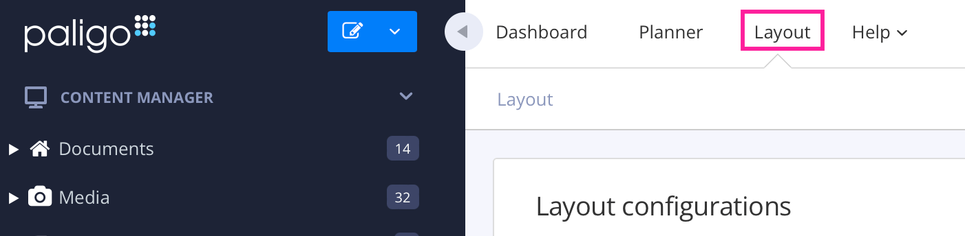
Paligo displays a list of Layouts. The list is empty if there are no custom Layouts in your Paligo instance.
-
Select the Layout you want to update or Create a Layout.
Tip
You can copy the URL of the Layout Editor and paste it into a new tab in your browser. This can be useful if you frequently switch between your Paligo content and the Layout settings.
-
Select Formal elements in the sidebar.

-
Select Enable in Use separate styling for label, number and title in formal elements.

When enabled, this setting adds
<span>to the HTML and class names so that each part can be styled differently using CSS. -
Select Save.
To be able to control the visibility of the numbering and labeling of span elements, you first have to Enable Span
Elements.
Then create a CSS file to show or hide the numbering and auto-generated labels of these elements.
Each element that has a title has a div and a class name in the HTML. There are also spans for each part of the title. For example, the HTML for a table title has this:
<div class="table-title">
    <span class="formal-label">
        <span class="formal-label-text">Table</span>
        <span class="formal-number"> 1</span>
        <span class="formal-label-delimiter">. </span>
    </span>
    <span class="formal-title">table title</span>
</div>
Tip
If you publish your content to HTML and view it in a browser, you can use the browser's inspect tool to view the HTML code and classes. You can also test changes to the CSS. To find out more, see Style with CSS.
Use CSS to hide the title numbers and also the auto-generated label:
-
Use a code or text editor to create a CSS file. Give it a suitable name and save it with the
.cssextension. -
Use CSS selectors to choose which parts you want to include or exclude.
For example, to hide a table's label, number, and delimiter after the number, use this code:
.table-title .formal-label { display:none; } -
If you want to keep the auto-text label, but hide the number and delimiter, use this code:
.table-title .formal-number, .table-title .formal-label-delimeter {
    display: none;
}
The other elements with titles have similar classes, for example, the example element has an
example-titleclass with span classes for formal-label, formal-label-text, formal-number, and formal-label-delimiter. -
Save your CSS file.
If your HTML5 output uses a custom Cascading Style Sheet (CSS), it is because a CSS file was uploaded to your Layout. To get your output to go back to having the default styling, remove the CSS file.
Tip
If you have the CSS file stored on your web server, it is a good idea to keep it in a different directory. That way, it is still available if you decide to go back to using its styling again.
To remove the CSS file from a layout:
-
Select Layout in the top menu.
Paligo displays a list of Layouts. The list is empty if there are no custom Layouts in your Paligo instance.
-
Select the Layout you want to update or Create a Layout.
Tip
You can copy the URL of the Layout Editor and paste it into a new tab in your browser. This can be useful if you frequently switch between your Paligo content and the Layout settings.
-
Select CSS, JS, logos and other assets in the sidebar.

-
Delete the reference in the CSS field.
-
Select Save.
When you publish with this Layout, your custom CSS will not be used in the output. The output will use the default styling instead.
Paligo has several admonitions that you can use in your content, including note, warning, danger, important and tip. Each admonition has its own default styling, but you can customize their appearance if needed.
For HTML publications, use CSS to style the admonitions. You add the styling information to a CSS file and then upload that to the HTML layout that you will use for publishing. The following sections explain how to make some of the most common changes.
For PDFs, use the Admonitions settings on the PDF Layout Editor Options.
Tip
To learn about CSS, this CSS Tutorial covers the basics and has links to more resources.
You can use CSS to change the color of the admonitions for HTML outputs. When you add your own CSS, replace the color codes with those for the codes you want to use.
For each admonition, you can change the color of the:
-
Left-margin border
-
Background
-
Symbol
-
Label text
-
Body text
For example, you could change the default green colors and black text of a note to blue with white text.


To the left - Default Note colors. To the right - Customized Note colors.
To change the colors for admonitions:
-
Use a code or text editor to create a CSS file. Give it a suitable name and save it with the
.cssextension. -
To change the color of the various parts of a note:
/* This part changes the color of the left-margin border and the background */ .note { border-left-color:#c5c6c8; background-color:#0540f0; } /* This part changes the color of the symbol */ .note::before { color:#ffffff; } /* This part changes the color of the label */ .note h3 { color:#ffffff; } /* This part changes the color of the body text */ .note > p { color:#ffffff; } -
To style other admonitions, add extra code and replace
.notewith the name of the admonition (for example.warning)./* This part changes the color of the left-margin border and the background */ .warning { border-left-color:#c5c6c8; background-color:#0540f0; } /* This part changes the color of the symbol */ .warning::before { color:#ffffff; } /* This part changes the color of the label */ .warning h3 { color:#ffffff; } /* This part changes the color of the body text */ .warning > p { color:#ffffff; }Important
Note that the danger admonition is called
.warning.danger. -
Save your CSS file.
-
When you publish content using the HTML layout, the CSS styles you have added will be included in the published output. Your custom styles take priority over the built in styles.
By default, admonitions have a text label with the admonition type shown before the admonition text. For HTML outputs, you can use CSS to hide the labels if you prefer to use admonitions that only use an icon.
For example, below the warning admonition has a "Warning" label.


To the left - Admonition label shown. To the right - Hidden admonition label and extra spacing applied to warning text.
To use CSS to hide or show the admonition labels:
-
Use a code or text editor to create a CSS file. Give it a suitable name and save it with the
.cssextension. -
To hide admonition labels, use this CSS code:
.caution h3, .important h3, .note h3, .tip h3, .warning h3{
    display: none;
}
This sets the labels for all of the admonition types (caution, important, note, tip and warning) to be hidden.
Tip
If your labels are already hidden and you want them to be shown, change
display:none;todisplay:block; -
Add some extra spacing for the body text of the admonition, to align it with the top of the admonition icon. This gives the text a 10px margin at the top, which is the same amount of spacing that is used for the icon, by default.
To do that, add this code to your CSS:
.warning > p, .note > p, .important > p, .caution > p, .tip > p {
    margin-top: 10px;
}
Note
If you have customized the position of the icon, you will need to adjust the text top margin to match your icon spacing.
-
Save your CSS file.
-
When you publish content using the HTML layout, the CSS styles you have added will be included in the published output. Your custom styles take priority over the built in styles.
For HTML outputs, the admonitions use a symbol from FontAwesome 4.6.3 or earlier. This means you can change the symbol with a customized CSS file that references a different symbol.
For PDFs, you can change symbols by uploading your own symbol in the Admonitions settings on the PDF Layout Editor Options.

To the left - Default Warning symbol. To the right - Customized Warning symbol.
To use CSS to change the symbol for HTML publications:
-
Refer to FontAwesome 4.6.3 to find the icon you want to use. Make a note of its code.
-
Use a code or text editor to create a CSS file. Give it a suitable name and save it with the
.cssextension. -
To change the symbol for a note, use this CSS code:
.note:before {
    content: '\f12a';
    font-family: FontAwesome;
}
In this example, we have used f12a as the example code for a FontAwesome symbol. You will need to replace that with the code for your chosen icon.
-
To adjust the spacing of the icon or its color. You can do that by setting its styles.
.note:before {
    content: '\f12a';
    color: #2ab27b;
    font-size: 30px;
    top: 30px;
    font-family: FontAwesome;
}
Here is an example of some styling for a note, where the color is set and the font size and top margin spacing have been increased.
-
To style the other admonition types, add extra code and replace
.notewith the name of the admonition (for example.warning)..warning:before { content: '\f12a'; color: #2ab27b; font-size: 30px; top: 30px; font-family: FontAwesome; }Important
Note that the danger admonition is called
.warning.danger. -
Save your CSS file.
-
When you publish content using the HTML layout, the CSS styles you have added will be included in the published output. Your custom styles take priority over the built in styles.
In Paligo, content and structure are separated from styling. This means that you do not apply styling directly to your tables. Instead, you style your tables with:
-
CSS for HTML output
-
Layout Editor for PDF output, see Style Tables (PDF)
Note
To get the styling working, you first need to Enable Table Styling for each layout that is to use the styled tables.
Before you can style your tables, you have to enable Output classes for styling of tables in the Layout Editor.
-
Select Layout in the top menu.
Paligo displays a list of Layouts. The list is empty if there are no custom Layouts in your Paligo instance.
-
Select the Layout you want to update or Create a Layout.
Tip
You can copy the URL of the Layout Editor and paste it into a new tab in your browser. This can be useful if you frequently switch between your Paligo content and the Layout settings.
-
Select Table Styles in the sidebar.

-
Ensure Output classes for styling of tables is set to Enable.

-
Select Save.
To create styles that will apply to all of your tables for HTML outputs:
-
Publish your content with the default styling for tables in place, and then open the output in your browser.
-
Use the browser's inspection tools to identify the class for the part of the table you want to style. For example, if you want to style the header row of your tables, use the inspection tool to find the table header cells in the underlying HTML. You will see that each header cell is styled by .th in the CSS.

Note
To find out more about using browser inspection tools, see Browser Inspection Tool.
-
Use the browser's developer tools to add new styling for the class. This will let you see what effect your changes will have when you add them to a CSS stylesheet. For example, if you want all table header rows to have a blue background color, you could enter:
.th { background-color: #557dc4; } -
When you are happy with the table stylings you have made, use a code editor or text program to create a new CSS file. Then add your custom styles to that and save it with the
.cssfile extension. -
Upload Customized CSS to your layout.
Then, when you publish with that layout, your content will use your custom CSS rules. Your CSS stylesheet will take priority over the Paligo CSS stylesheet.
To create styles that will only apply to certain tables for HTML outputs, you have to open the topic that contains the table to be styled.
-
Select the topic or component in the Content Manager to open it in the Editor.
Alternatively, you can Create a Topic and edit that.
-
Position the cursor inside the table.
-
Select the
tableorinformaltableelement in the Element Context Menu and choose Go to element.
-
Add the
tabstyleattribute in the Element Attributes Panel. -
Enter a style name as attribute value.
It will be used as a style name in the HTML output and you will use it in your CSS. It is a good idea to use a name that is easily identifiable.

For example, you might use "Instruments" for tables that contain details about technical instruments.
-
Select Save.

-
Publish your content and open it in a browser.
-
Use the browser's inspection tools to find the class for your table. This should match the name you have given to the
tabstyleattribute.Note
To find out more about using browser inspection tools, see Browser Inspection Tool.
-
Use the browser's developer tools to add new styling for the table class. For example, you could give an "instruments" table header cells that have a yellow background, like this:
.instruments th { background-color:#ffff00; } -
When you are happy with the table stylings you have made, use a code editor or text program to create a new CSS file. Then add your custom styles to that and save it with the
.cssfile extension. -
Upload Customized CSS to your layout.
Then, when you publish with that layout, your content will use your custom CSS rules. Your CSS stylesheet will take priority over the Paligo CSS stylesheet.
Use CSS to style a table for HTML5 output. Depending on your requirements, you can:
-
Apply Styles to All Tables (HTML) - To set styles that will apply to every table, create a CSS file and use selectors that target the table elements. We include some examples at the end of this section
-
Apply Styles to Selected Tables (HTML) or parts of tables - To set styles that apply to some, but not all tables, you first need to give the tables a class attribute and value. You can then use CSS to style those classes for the HTML5 output.
Open the topic that contains the table if you are to apply styles to specific tables (or parts of those tables):
-
Select the topic or component in the Content Manager to open it in the Editor.
Alternatively, you can Create a Topic and edit that.
-
Select the table element that you want to style in the Element Structure Menu:
-
table- To style the entire table, for example, for adding a border to the table. -
thead- To style the table header. -
th- To style an individual cell in the table header. -
tr- To style a particular row. -
tbody- To style the body text in the table (not including headers or footers). -
td- To style an individual table cell. -
tfoot- To style the table footer.
-
-
Add one of the attributes below in the Element Attributes Panel.
Enter the class name that will appear in the HTML as
value. Use lowercase for the value and do not include spaces.-
tabstyle- Usetabstyleon thetableorinformaltableelement. This is for applying a class name to the table as a whole. If you use your content in HTML5 and PDF outputs, you will need to set the value to tabstyle 1 to 5 to match the table styles for PDF. If you only publish to HTML, you can set thetabstylevalue to any class name. -
role- As an alternative totabstyle, you can use role ontableelements andinformaltableelements. Set the value to the class name you want to appear in the HTML5 output. Paligo will only use theroleand class name for HTML5 outputs. -
class- Use on elements inside the table, such asthead,tfoot,tr, andtd. Set the value to the class name you want to appear in the HTML5 output.

-
-
Select Save.
-
Use a third-party code editor or text editor to create a CSS file.
-
Use CSS to style the table elements for the HTML output.
When defining your CSS, you need to consider that your Paligo content may contain tables and also informal tables. The Paligo HTML5 output also uses tables for layout in certain places, for example, with some images. Typically, you will want to avoid styling the tables that are used for layout, so that your styles only affect the tables and informal tables.
We have included some examples of commonly used table selectors (see the examples after this procedure).
-
Save your CSS file and Upload Customized CSS.
-
Publish your content using the HTML5 Layout you edited in the previous step.
Paligo generates your HTML5 Help Center. It includes your custom CSS. When you open it in a browser, the browser will apply the CSS rules to your tables.
CSS Selectors for Targeting All Formal and Informal Tables. Here are some example selectors for applying styles to all tables, informal tables only and formal tables only:
-
Entire table:
To target all formal tables and informal tables, without targeting other tables that Paligo uses for images and other layout purposes:
table.table, table.table-bordered, table.informaltable { /* Your styles here */ } -
Table header:
To target the table header in formal tables and informal tables:
.table .thead, .informaltable .thead { /* Your styles here */ } -
Table body:
The following selector targets the body of formal tables and informal tables. The body styling applies to every cell in the main part of the table, unless it is overridden by more specific styling. It is not used to style the header or footer.
.table tbody td, .informaltable tbody td { /* Your styles here */ } -
Table row:
To target all rows in formal tables and informal tables:
.table tr, .informaltable tr { /* Your styles here */ } -
Table cells:
To target all cells in formal tables and informal tables:
.table td, .informaltable td { /* Your styles here */ } -
Table footer:
To target the cells in a table footer for both formal tables and informal tables:
.table tfoot td, .informaltable tfoot td { /* Your styles here */ } -
Target formal table only:
To target formal tables only, remove the informaltable parts of the selector. For example, if you only want to target the body of formal tables, use:
.table tbody td { /* Your styles here */ } -
Target informal table only:
If you only want to target informal tables, remove the formal table part, for example:
.informaltable tbody td { /* Your styles here */ } -
Alternate row shading:
To shade the background of alternate rows in tables:
.table tbody tr:nth-child(even),
.informaltable tbody tr:nth-child(even) {
  background-color: #000000; /* Change to color of your choice */
}
The following CSS is an example for giving formal tables and informal tables the same styling.
 |
The CSS for these tables is:
 /* Target table and informaltable, style the border around the edge of table,
remove space after table but inside container div.  */

table.table,
table.table-bordered,
table.informaltable {

    /* table.table-bordered makes sure that we do not target tables that are used for layout, such as
        tables for image alignment.
  */

    /* remove space after table, inside div */
    margin-bottom: 0px !important;

     /* Your styles here */
    border: 2px solid #017efa !important;
}


 /* Target table and informaltable header, style the background color and text color */

.table thead, .informaltable thead {

    background-color: #017efa;
        color: white;
}


 /* Target table and informaltable body, style the font size */

.table tbody,
.informaltable tbody {

         /* Your styles here */
         font-size:8pt;
}


 /* Target table and informaltable row, style the font size */

.table tr,
.informaltable tr {
         /* Your styles here */
        font-size: larger;
}


 /* Target all body and footer cells in table and informaltable, style the alignment */

.table td,
.informaltable td {
          /* Your styles here */
          text-align: center;
}

 /* Target all cells in header for table and informaltable, style the alignment */

.table th,
.informaltable th {
          /* Your styles here */
          text-align: center;
}


/* Target all cells in footer of table and informaltable, style the background color and text color */

.table tfoot td, .informaltable tfoot td {
        background-color: #FD1F9BBD;
        color: white;
}


/* Target all even rows in table and informaltable, style the background color */

.table tbody tr:nth-child(even),
.informaltable tbody tr:nth-child(even) {
   background-color: azure; /* Change to color of your choice */
}


/* Target internal borders of each cell in the header, body, footer of a formal table,
 style the cell borders */

.formaltable > tbody > tr > td,
 .formaltable > tbody > tr > th,
  .formaltable > tfoot > tr > td,
  .formaltable > tfoot > tr > th,
  .formaltable > thead > tr > td,
  .formaltable > thead > tr > th {
        /* Your styles here */
        border: 1px solid #ddd;
}


/* Target internal borders of each cell in the header, body, footer of an informal table,
 style the cell borders */

.informaltable > tbody > tr > td,
 .informaltable > tbody > tr > th,
  .informaltable > tfoot > tr > td,
  .informaltable > tfoot > tr > th,
  .informaltable > thead > tr > td,
  .informaltable > thead > tr > th {
        /* Your styles here */
        border: 1px solid #ddd;
}
CSS Selectors for Specific Tables (Tabstyle and Class required). Here is an example of CSS that is designed to style a specific informal table that has:
-
informaltableelement with thetabstyleorroleattribute, with a value of custominfomaltable. -
A cell in the informal table with the class attribute and a value of lastcell.
The styles only apply to tables that have the attributes listed above. They do not apply to other tables.
 |
The CSS for this table is:
/* set border on entire "custominformaltable" informaltable */

.informaltable.custominformaltable {
        border-style: groove;
        border-color:#ddd;
}


/* set background color and text color for "custominformaltable" informaltable header */

.informaltable.custominformaltable thead {
        background-color:#4f5f77;
        color:white;
}


/* set background color and text color for "custominformaltable" informaltable footer */

.informaltable.custominformaltable tfoot td{
        background-color:#4f5f77;
        color:white;
}


/* set background color and text color for "custominformaltable" informaltable footer */

.informaltable.custominformaltable tfoot {
        background-color:#4f5f77;
        color:white;
}


/* set background color for even rows in "custominformaltable" informaltable */

.informaltable.custominformaltable tbody tr:nth-child(even) {
  background-color: #aee4f9;
}


/* set background color for odd rows in "custominformaltable" informaltable */

.informaltable.custominformaltable tbody tr:nth-child(odd) {
  background-color: #f6f9fb; /* Change to color of your choice */
}


/* set background color and text color for cell with class name "lastcell" */

.informaltable.custominformaltable .td.lastcell {
        background-color:hotpink;
        color:black;
}


/* set border on entire "custominformaltable" informaltable */

.informaltable.custominformaltable {
        border-style: groove;
        border-color:#ddd;
}


/* set background color and text color for "custominformaltable" informaltable header */

.informaltable.custominformaltable thead {
        background-color:#4f5f77;
        color:white;
}


/* set background color and text color for "custominformaltable" informaltable footer */

.informaltable.custominformaltable tfoot {
        background-color:#4f5f77;
        color:white;
}


/* set background color for even rows in "custominformaltable" informaltable */

.informaltable.custominformaltable tbody tr:nth-child(even) {
  background-color: #aee4f9;
}


/* set background color for odd rows in "custominformaltable" informaltable */

.informaltable.custominformaltable tbody tr:nth-child(odd) {
  background-color: #f6f9fb; /* Change to color of your choice */
}


/* set background color and text color for cell with class name "lastcell" */

.informaltable.custominformaltable .td.lastcell {
        background-color:hotpink;
        color:black;
}
When you have created a customized CSS file, upload it to your HTML layout in Paligo. Your content will use the uploaded CSS file the next time you publish with that layout.
Important
When you upload a CSS file, it will replace any CSS file that is currently associated with the layout.
Note
If you are using an HTML layout rather than an HTML5 layout, the CSS upload feature is in the General category.
-
Select Layout in the top menu.
Paligo displays a list of Layouts. The list is empty if there are no custom Layouts in your Paligo instance.
-
Select the Layout you want to update or Create a Layout.
Tip
You can copy the URL of the Layout Editor and paste it into a new tab in your browser. This can be useful if you frequently switch between your Paligo content and the Layout settings.
-
Select CSS, JS, logos and other assets in the sidebar.
-
Select Upload in the CSS section.

Important
When you upload a CSS file, it will replace any CSS file that is currently associated with the layout.
Note
If you are using an HTML layout rather than an HTML5 layout, the CSS upload feature is in the General category.
-
Drag your custom CSS file from your computer's file system onto the file upload dialog.

Paligo uploads the CSS file to the Paligo server.
Note
You should only upload validated CSS files that have the
.cssfile extension. -
Select Save.
If you want to use Google fonts in your HTML5 help center, you can import them by using CSS. There's no need to add them to Paligo's HTML5 output.
To import Google fonts:
-
Browse to fonts.google.com and choose the fonts that you want to use. Depending on the fonts, you can choose different weights and languages too.
-
Get the import url for your font selections.

Note
It's important that you use the import url for the font(s) and not the standard embed url (they are different).
-
Use a CSS editor to create a CSS file.
-
Add the following code to your CSS file:
@import url(''); -
Copy the import url for your selected fonts inside the single quotation marks:
@import url('https://fonts.googleapis.com/css?family=Open+Sans:300,300i,400,400i,600,600i,700,700i,800,800i|Roboto&subset=cyrillic,cyrillic-ext'); -
In the CSS file, apply the fonts to the classes that you want to style. For example, to style the
bodyclass you could use:body { font-family: 'Open Sans'; font-size: 22px; } -
Save your CSS file.
When you use the layout for publishing, the HTML5 output will include the CSS file. When a user visits your help center, the browser will import the fonts from Google.
It is highly recommended that you customize vertical alignment for inline images in your custom CSS file according to your own use case, as the default CSS will not fit all use cases.
There are so many use cases that no CSS will fit everyone, but as an example below is CSS for users with perfectly sized icon images without margins. This code positions the images inline with the bottom of the text. (If you want the icon to be aligned in the middle of the text line, just change the first vertical-align to "middle" instead of "baseline").
Tip
Read more about possible vertical alignment adjustments, see Mozilla.
-
Add the following code to your CSS file:
.inlinemediaobject img:not([height]):not([width]) { height: 80%; vertical-align: baseline; } .inlinemediaobject { vertical-align: baseline; } -
Upload your CSS file to your HTML layout, see Upload Customized CSS.
Note
If you want to use the valign attribute on the inline images in your topics ("top", "middle", "bottom"), to have individual vertical alignment for certain inline images, you would need to either reduce the height value above, or increase the lineheight of the enclosing block
element in your CSS (such as the p tag). Otherwise such attributes would have no effect as there would be no space for such alignment.