Style Portal Page
The HTML5 Help Center has a portal page, which is the first page you see when you launch the index.html file for the help center. You can use CSS, JavaScript and attributes in Paligo to change the appearance of the various elements on the portal page.
For many of the features of the portal page, you will use CSS to change the appearance. If you are unfamiliar with CSS style sheets and working with the browser's inspection tool, see Style with CSS.
To help you style your portal page, we have included sections that explain how to make the most commonly requested changes. These include changing the font colors, background images, and choosing which topics appear in the Category Panel Section and more.
 |
The HTML5 Help Center page using the default CSS stylesheets.
By dedicating a topic as a start page and activating the start page feature for the HTML5 configuration, you can choose a different start page for the HTML5 Help Center.
Note
This feature is primarily for single-language publications, since the language selection occurs on the index.html page. It can still be used for multi-language publications, but the redirect will occur to the default output language.
To be able to choose a different start page for the HTML5 Help Center, the topic (that is to be the start page) has to be updated with the start-page role. If there are several topics with this setting, it will be the topic with the topmost position that will be used.
Tip
You probably want to set this on a topic that will become a page of its own. But it will actually work on internal sections, reused components or sections that has been chunked to internal sections as long as it is part of the TOC.
-
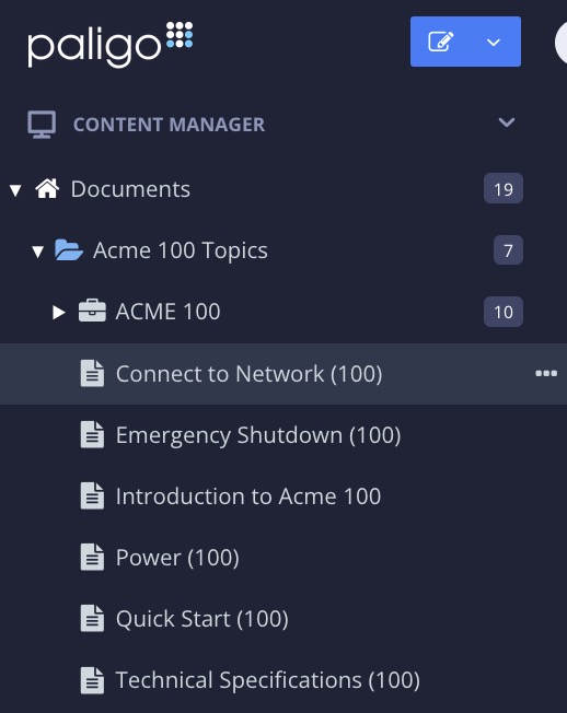
Create a new topic or open an existing topic.
-
Select the top section in the Element Structure Menu and choose Go to element.

-
Add the attribute
Rolein Element Attributes Panel.
-
Add the value
start-page. -
Select Save.

The ability to choose a different start page for the HTML5 Help Center must be activated via the Layout tab. By enabling this setting, the topic that has a start-page role will become the start page.
Note
If this setting is enabled and no topic is found having the start-page role, the redirect will go to the so called "publication page". That is the en/index-en.html for an English publication or to sv/index-sv.html for a Swedish
publication.
-
Select Layout in the top menu.
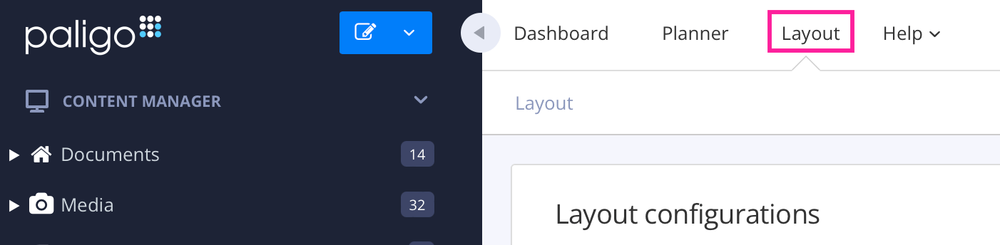
Paligo displays a list of Layouts. The list is empty if there are no custom Layouts in your Paligo instance.
-
Select the Layout you want to update or Create a Layout.
Tip
You can copy the URL of the Layout Editor and paste it into a new tab in your browser. This can be useful if you frequently switch between your Paligo content and the Layout settings.
-
Select General.
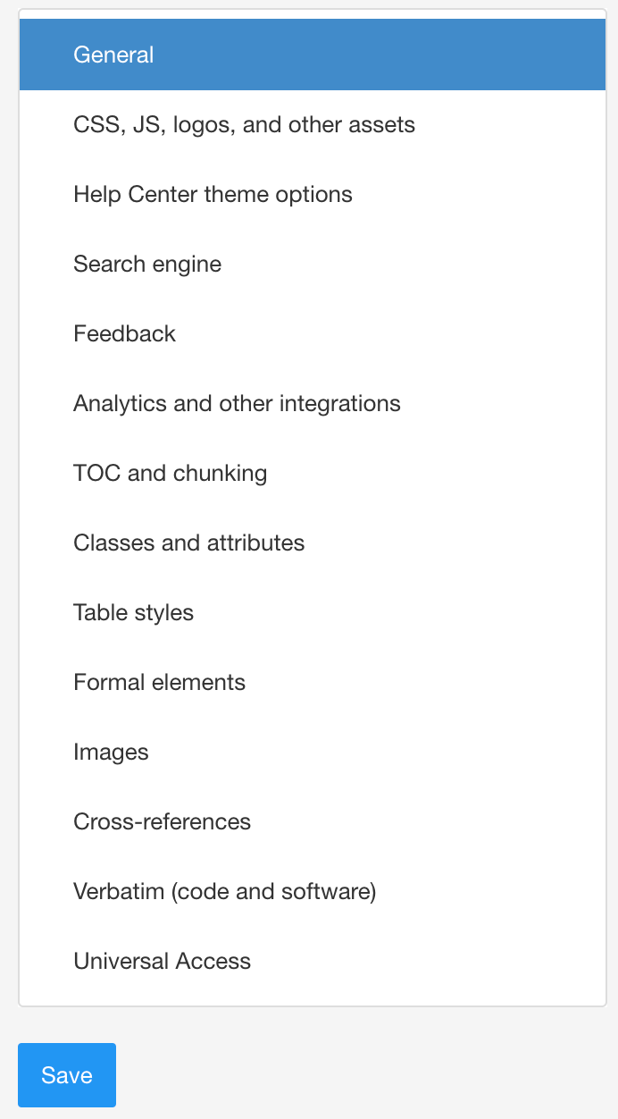
-
Scroll down to Choose start page by role for HTML5 Help Center.

-
Select Enabled from the menu.
-
Select Save.
Your sample HTML5 Help Center still has the default Paligo logo. To swap it for your own logo, use the Logotype setting in the Layout you use for publishing.
In Paligo:
-
Select Layout in the top menu.
Paligo displays a list of Layouts. The list is empty if there are no custom Layouts in your Paligo instance.
-
Select the Layout you want to update or Create a Layout.
Tip
You can copy the URL of the Layout Editor and paste it into a new tab in your browser. This can be useful if you frequently switch between your Paligo content and the Layout settings.
-
Select CSS, JS, logos and other assets in the sidebar.

-
In the Logotype setting, select the Upload button.

-
Drag-and-drop your logo image file into the upload box.
Paligo uploads your image. It is given a new name (a number) and a reference is added to the Logotype setting.

-
Select Save.
You have now uploaded the logo image to the Layout. When you publish (next stage of tutorial), Paligo will use your logo instead of the Paligo logo.
 |
The HTML Help center's portal page has a welcome message at the top. By default, it is "How can we help you today?", but you can use javascript to change it to any text you like.
 |
The following code shows the javascript you can use. We have included an example of a translation as well, in this case, Japanese, so that you can see how it can be handled for other languages. For each language you want to use, add another language line and text.
-
Use a third-party code or text editor to create or update a JavaScript (JS) file.
For example,
mycustomscript.js. -
Add the following code to your JavaScript file:
$(document).ready(function () { setWelcomeText(); $(document).ajaxComplete(function () { setWelcomeText(); }); }); function setWelcomeText(){ for (var key in welcomeTextDict) { var element = $("header.portal-header[data-portal-language=" + key +"] h1"); element.text(welcomeTextDict[key]) } } var welcomeTextDict = { "en" : "Text displayed in English", "ja" : "Text displayed in Japanese"}; -
The only parts you need to change are at the end of the script:
-
The "en" : "Text displayed in English" part defines the language (en) and then the text that will be used for that langage. So change "Text displayed in English" to the text you want your English language version of the portal page to use, for example, "Welcome to ACME Help".
-
The "ja" : "Text displayed in Japanese" is an example of the code you need for translations. For each language, add the HTML language code and then the text you want to use. For example, if you wanted a French version, you would add "fr" : "Bienvenue à l'aide d'acme"
Note
Note that the
};goes after the last translation and is not needed for each line.
-
-
Save your JS file.
You can use CSS to change the styling of the main "How can we help you today?" heading on your HTML5 help center's portal page. For example, you can change the font, the font size, and the color.
 |
Heading with different font, font size, and color.
Here, we will cover some of the main attributes that you can change for the heading. But there are many more, including margins. If you want to make changes that are not covered here, we recommend that you use the browser's inspection tools to find the heading classes and experiment with changing the attributes and values.
To change the portal heading color:
-
Use a third-party code or text editor to create or update a CSS file.
For example,
mystyles.css. -
Add the following code to your CSS file:
.portal-header h1 {
color: #ff8c00;
}
Where #ff8c00 is the HTML code for the color you want to use. In this example, we have used the code for dark orange.
-
Save your CSS file.
You can use CSS to change the font that is used for the "How can we help you today?" heading on the help center portal page.
-
Use a third-party code or text editor to create or update a CSS file.
For example,
mystyles.css. -
Add the following code to your CSS file:
.portal-header h1 {
font-family:"Times New Roman", Times, serif;
}
Where "Times New Roman", Times, serif is the definition for the font you want to use. In this example, we have used Times New Roman, with Times used if Times New Roman is unavailable, and a serif font as a fallback option.
-
Save your CSS file.
You can use CSS to change the size of the "How can we help you today?" heading on the help center portal page.
-
Use a third-party code or text editor to create or update a CSS file.
For example,
mystyles.css. -
Add the following code to your CSS file:
@media (min-width: 768px).portal-header h1 {
font-size: 60px;
}

.portal-header h1 {
font-size: 30px;
}
The first CSS class uses a media query. In this case, if the content is viewed on a display that is 768 pixels or more, the portal-header h1 will use a font size of 60px.
The second CSS class defines the size for the portal-header h1 class if the page is viewed on a display that is less than 768 pixels. In this case, it will use a font size of 30px.
Replace the font size values with the sizes you want to use.
-
Save your CSS file.
The HTML5 help center has a background photo with a blue overlay by default. You can use CSS to change these by uploading a different image and applying a different overlay color.
You can change the image, change the overlay color, or both. If you prefer, you can remove the background image completely.
 |
Tip
There are several images included in the theme and you can find them in the css/image folder of your published output. You can upload these images to the layout to try them out, or you can upload your own images.
You can use the HTML5 help center layout to change the background image that is shown in the top section of the HTML5 help center portal page.


To the left - The default HTML5 Help Center with a blue overlay color. To the right - A customize portal page with a gray overlay color.
To change the portal background image:
-
Select Layout in the top menu.
Paligo displays a list of Layouts. The list is empty if there are no custom Layouts in your Paligo instance.
-
Select the Layout you want to update or Create a Layout.
Tip
You can copy the URL of the Layout Editor and paste it into a new tab in your browser. This can be useful if you frequently switch between your Paligo content and the Layout settings.
-
Select CSS, JS, logos and other assets in the sidebar.
-
Select Upload in Help Center Portal Page Background Image.

Paligo will upload the image file and assign a filename.
-
Drag and drop the image file that you want to use into the dialog.

-
Select Save.
When you use this layout to publish your content, the help center will use the image you uploaded.
The HTML5 help center has a background image in the top section and there is also a semi-transparent colored overlay. The overlay is blue by default, but you can use CSS to change it to any color.
To change the portal overlay color:
-
Use a third-party code or text editor to create or update a CSS file.
For example,
mystyles.css. -
Add the following code to your CSS file:
.portal-header::before { background-color: #555; } -
Replace #555 with the HTML code for the color you want to use.
If you want to use a gradient, that's possible too. But in that case, use "background" instead of "background-color":
.portal-header::before {
   background: linear-gradient(to right , rgb(0, 104, 191) 8% , rgb(33, 150, 243) 50% , rgb(100, 66, 255) 95%);
}
You can easily generate the gradient code with an online generator, for example, this one.
-
Save your CSS file.
If you want your help center portal to have no background image, you can remove it with CSS. The section will then use an overlay color only.
 |
To change the portal overlay color:
-
Use a third-party code or text editor to create or update a CSS file.
For example,
mystyles.css. -
Add the following code to your CSS file:
.portal-header::after{ background: none; } -
Save your CSS file.
You can use CSS to change the search bar colors on the HTML5 help center's portal page. By default, the search bar has a semi-transparent white background, with an orange search button and white search icon. But you can change them to any colors that you want.
 |
-
Use a third-party code or text editor to create or update a CSS file.
For example,
mystyles.css. -
Add the following code to your CSS file:
.portal-header .search-field { background-color: rgba(195, 46, 46, 1); } .portal-header .portal-search button, .publication-contents h4 span { background-color: #00d3f5; } .portal-header .portal-search button { color: #100000; } -
Replace the color values with the colors you want to use.
-
.portal-header .search-fieldis for the background of the search box. -
.portal-header .portal-search button, .publication-contents h4 spanis for the background color of the search box button (at the end of the search box) -
.portal-header .portal-search buttonis for the color of the icon in the search box button.
Note
The background color for the search box button is also used for the number icons next to the topics that are listed in the bottom section of the portal page.
-
-
Save your CSS file.
By default, the HTML5 help center portal is divided in two sections:
-
Category Panels (1) generated for top-level topics or subpublications (publications nested inside a main publication) and topics with the
roleattribute set tocategory-panel, see Topics for Category Panels. -
Featured Content (2) links generated for the first 4 top-level topics and topics with the
roleattribute set topromoted-content, see Topics for Featured Content.
By using the Disregard portal category and promoted content feature in the Layout Editor for HTML5 Help Center portals, you can make Paligo ignore topics set as category-panel or promoted-content with the role attribute. This can be useful if you reuse content with these attributes and find that you need these topics to show for one publication, but not for others.
 |
1 = Category Panels, 2 = Featured Content links
Tip
It is possible to hide the Featured Content section from your portal page, see Remove Featured Content Section .
To make Paligo ignore topics set as category-panel or promoted-content:
-
Select Layout in the top menu.
Paligo displays a list of Layouts. The list is empty if there are no custom Layouts in your Paligo instance.
-
Select the Layout you want to update or Create a Layout.
Tip
You can copy the URL of the Layout Editor and paste it into a new tab in your browser. This can be useful if you frequently switch between your Paligo content and the Layout settings.
-
Select Classes and attributes in the sidebar.
-
Set Use the portal-category and promoted-content roles to:
-
Yes - Paligo will create extra category panels for topics with the
role:portal-categoryattribute and value. It will also create extra links in the Featured Content section for any topics that have therole:promoted-contentattribute and value. -
No - Paligo will ignore
role: portal-categoryandrole: promoted-contentattributes and values. When it generates a portal page, it will use the default settings for category panels and featured content. -
Default to inherit the value for this setting from the base Layout. The base Layout is either a built-in Layout provided by Paligo or another custom Layout, see Layout Relationships - Base, New, Duplicate.
-
-
Select Save.
When you publish with this layout, Paligo will apply the settings you have chosen.
The HTML5 help center has a "breadcrumb" at the top of the page that shows the path from the home page to the currently displayed topic. Each part of the breadcrumb is a clickable link to that topic.
By default, the home link is named the same as your publication. If you select it, the Publication Topic is shown. You can make it display a different page of your choice (for example to return to the start page).

To change the breadcrumb homepage link:
-
Use a third-party code or text editor to create or update a JavaScript (JS) file.
For example,
mycustomscript.js. -
Add the following code to your JavaScript file:
$(document).ready(function () {
    $('.breadcrumb .breadcrumb-link:first-child a').attr('href', '/index.');
});
Note
if you are editing a javascript file that you already use for Paligo publications, just add this line:
$('.breadcrumb .breadcrumb-link:first-child a').attr('href', '/index.');It needs to be anywhere after the opening $(document).ready(function () { and before the }); in your script.
-
Change the 'index.html' part to an absolute URL for the page that you want the breadcrumb link to go to. The URL needs to define the route from the server to the index.html file. As an example, the Paligo help center has this:
$(document).ready(function () { $('.breadcrumb .breadcrumb-link:first-child a').attr('href', '/docs/index.html'); }); -
Save your JS file.
When you publish with this layout, the custom javascript is included. In the published output, it will tell the browser to display the page you included in the javascript when the breadcrumb homepage link is selected.
The HTML5 help center portal page has "category panels" that link to topics or publications. By default, each category panel links to a top-level section or "subpublications" in your help center, and uses an icon from FontAwesome 4.6.3.
You can change the icons, change the color of the icons, and replace the icons with your own images. You can also choose which topics or "subpublications" have category panels.
 |
Category panels links to subpublications or subsections.
Note
Paligo gives the first four category panels individual icons and any other panels are given the "document" icon. You can use CSS to change any of the icons.
Paligo adds individual icons to the first four category panels and then adds a "document" icon to any further panels.
You can use a CSS file to change the icons to any icons in Font Awesome 4.6.3. Icons that appear in later versions of FontAwesome may not work with Paligo content. If you want to change the color of the icons, see Color of Category Panels.
Tip
You can use javascript to replace the icons with your own images, see Replace Category Icons with Images.
-
Use your Browser Inspection Tool to discover the class name of the category panel that you want to change.
Each category panel has its own class name which Paligo designates based on the order of the panels. For example, the first category panel has the class name
.cat-panel-1.Note
If you are unfamiliar with CSS and using browser inspection tools, we recommend that you first look at Style with CSS.
To learn about CSS, this CSS Tutorial covers the basics and has links to more resources.
-
Use a third-party code or text editor to create or update a CSS file.
For example,
mystyles.css. -
Add the following code to your CSS file:
.cat-panel-1:before{ content: "\f29a"; } -
Change
.cat-panel-1to the class name you discovered in step one, for example,.cat-panel-5:before. -
Replace
"\f29a"with the icon code from Font Awesome 4.6.3.The
"\f29a"is an icon code from Font Awesome.-
The code must be inside quotation marks.
-
Remember to use a backslash as shown above.
-
Use a semi-colon
;after the closing quotation mark.
-
-
Save your CSS file.
If your FontAwesome icons are not appearing in your Paligo output, make sure that:
-
You have followed the instructions for adding the icons carefully.
-
You have used icons that are included in FontAwesome 4.6.3. Icons from later versions of FontAwesome are not supported.
Note
If you are using icons from FontAwesome 4.6.3 and still have problems, contact customer support for assistance.
By default, the background of the category panels is white, the icons are blue, and the text is dark gray.
You can use CSS to change the colors to suit your own requirements, for example, in the image shown, the panel backgrounds are gray, with red icons and text.
 |
-
Use a third-party code or text editor to create or update a CSS file.
For example,
mystyles.css. -
Add the following code to your CSS file:
.portal-single-publication a { color: #DC143C; background-color: #C0C0C0; } .portal-single-publication .publication-icon { background-color: #DC143C; } -
Replace the color values with the colors you want to use.
-
.portal-single-publication ais for styling the category panel .-
colorapplies to the text. Replace#DC143Cwith the HTML color code to be used. -
background-colorapplies to the panel background. Replace#C0C0C0with the HTML color code to be used.
-
-
.portal-single-publication .publication-iconis for styling the icon. Replace#DC143Cwith the HTML color code to be used.
-
-
Save your CSS file.
Paligo uses icons for each category panel shown on the HTML5 Help Center portal page. You can replace these icons with your own images available online (or on a local network if you publish offline). To find supported file formats, see the Mozilla website: https://developer.mozilla.org/en-US/docs/Web/HTML/Element/img.
There are no size limitations on the images. However, Paligo recommends that you:
-
Consider that larger files may result in longer page loading times.
-
Use images with the same dimensions.
Use JavaScript to instruct the browser to replace existing images with new ones:
-
Use a third-party code or text editor to create or update a JavaScript (JS) file.
For example,
mycustomscript.js. -
Add the following code to your JavaScript file:
$(document).ready(function() {

var icon1 = "url of image 1";
var icon2 = "url of image 2";
var icon3 = "url of image 3";

$(".cat-panel-1").closest("a").prepend("<img src='" + icon1 + "'></img>");
$(".cat-panel-2").closest("a").prepend("<img src='" + icon2 + "'></img>");
$(".cat-panel-3").closest("a").prepend("<img src='" + icon3 + "'></img>");

$(".publication-icon").remove();

});
Note
The
$(document).ready(function() {at the start of the script and the});at the end mark the start and end of the function.-
If you are creating a new JS file, you need to include these.
-
If you are adding the script to an existing JS file, it will already have the ready function start and end in place, so do not include them. But make sure you add the rest of the code above the closing
]);in the script file.
-
-
Replace the text inside the quotation marks with the URL of your image.
The script declares variables called
icon1,icon2, andicon3. Each variable is a reference to the image URL.If you want to include more, add a new line using the same syntax. For example, if you wanted four images, you would add
var icon4 = "url of image 4";where the URL is the actual address of the image file. -
If you added more image variables, you also need to add extra
"cat-panel"references. There should be one for each variable, and they look like this:$(".cat-panel-1").closest("a").prepend("<img src='" + icon1 + "'></img>");In the HTML structure of the help center's "portal" page, each category image is contained in a "cat-panel" section and these are numbered. So the line above works by telling the browser to find the
"cat-panel"for category 1, and then find the anchor that comes before it.When the anchor is found, the browser adds an image element that references the
icon1variable that defines the location of the image.For each variable that you added to the script, add a new instruction line. For example, if you have four variables, add this line for the fourth variable:
$(".cat-panel-4").closest("a").prepend("<img src='" + icon4 + "'></img>"); -
Save your JavaScript file.
By default, the HTML5 help center has category panels for all top-level topics (or sub-publications if you publish a parent portal). But you can choose different topics if you prefer.
|
The HTML5 help center portal page can show up to 4 category panels when it first loads. There is a "Show All" link to reveal any further category panels.
To choose your own topics for the category panels:
-
Select the topic or component in the Content Manager to open it in the Editor.
Alternatively, you can Create a Topic and edit that.
-
Select the
sectionelement in the Element Structure Menu.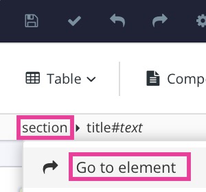
-
Select Go to element.
-
Add the
roleattribute and give it the value:portal-categoryin the Element Attributes Panel
-
Select Save.
-
Repeat steps 1 to 4 inclusive for each topic that you want to be included as a category panel.
You can use CSS to remove the category section from the HTML5 help center portal page.
|
Note
This topic covers the category panel section only. For the featured content section, see Remove Featured Content Section.
To remove the Category Panel section from the portal page:
-
Use a third-party code or text editor to create or update a CSS file.
For example,
mystyles.css. -
Add the following code to your CSS file:
.portal-publications .inner-row { display:none; } .show-all-category { display:none; }-
.portal-publications .inner-rowis the category panels section. -
.show-all-categoryis the "show all" link that reveals category panels 5 and upwards.
-
-
Save your CSS file.
It is possible to add a link to an external source (like API docs or a support page) and make it a category panel in the Category Panel Section.
There are two ways of doing this, you can add a topic to the publication and redirect via a server, or by using JavaScript to clone a category panel.
|
Tip
To change the tile icons, see Font Awesome Icons in Category Panel.
To use JavaScript to clone a category panel:
-
Add this to your JavaScript file:
$(document).ready(function(){ // Panel position var position = 0; // Icon/image url var cloneIcon = ""; // Link url var cloneLink = ""; // Title text var cloneTitle = ""; var $original = $('.portal-single-publication').eq(position); var $clone = $original.clone(); $clone.children('a').first().attr('href', cloneLink); $clone.find('.cat-panel').first() .removeClass() .addClass('fa cat-panel') .closest('a') .prepend("<img src='" + cloneIcon + "'></img>") .find('.publication-icon') .remove(); $clone.find('h3').text(cloneTitle); $original.after($clone); }); -
Modify the following variables in the first couple lines of code:
position=””,cloneIcon=””,cloneLine=””andcloneTitle=””.For example:
var position = "3";
var cloneIcon = "https://mycustomsite.com/icon.png";
var cloneLink = "https://google.com";
var cloneTitle = "Google Link";
-
If you want the new category panel to always be last in the list, you can remove the
positionvariable line (line 3) and change line 11 to:var $original = $('.portal-single-publication').last(); -
Save your JavaScript file.
For some HTML5 outputs, including classic and API, the first page users will see (the landing page) is a language selection page. This applies even if you only publish in one language. If you prefer, you can disable this feature so that the browser shows the documentation's "home" page instead.
 |
To set your output to show the documentation "home" page instead of the language selection page:
-
Select Layout in the top menu.
Paligo displays a list of Layouts. The list is empty if there are no custom Layouts in your Paligo instance.
-
Select the Layout you want to update or Create a Layout.
Tip
You can copy the URL of the Layout Editor and paste it into a new tab in your browser. This can be useful if you frequently switch between your Paligo content and the Layout settings.
-
Select General in the sidebar.
-
Use the Skip Language selection page for Classic HTML5, Single Page, and API style outputs setting to control the language page.

Set it to:
-
Enable - To set the browser to show the documentation "home" page instead of the language selection page.
-
Disable - To set the browser to show the language selection page.
-
-
Select Save.
When you publish content using this layout, it is set up to use the landing page you have chosen. Depending on your choice in the layout, the first page the user sees will be either the language selection page or the documentation "home" page.
To make your website comply with global regulations regarding cookies, you should enable the Cookie consent popup in the Layout Editor. Your website visitors will then be welcomed with a cookie banner.
The are two different cookie banners to choose between:
-
Opt-out - This option offers the possibility to Decline or Allow cookies.
-
Info - This option only informs that the website use cookies.
Important
Paligo disclaims any responsibility for your output complying with cookie regulations, and it is up to you to ascertain that the output does not violate any cookie regulations or similar, with or without this popup enabled.
-
Select Layout in the top menu.
Paligo displays a list of Layouts. The list is empty if there are no custom Layouts in your Paligo instance.
-
Select the Layout you want to update or Create a Layout.
Tip
You can copy the URL of the Layout Editor and paste it into a new tab in your browser. This can be useful if you frequently switch between your Paligo content and the Layout settings.
-
Select Analytics and other integrations in the sidebar.

-
Select the cookie banner behavior in Use cookie consent popup:

-
Opt-out - This option offers the possibility to Decline or Allow cookies.

-
Info - This option only informs that the website use cookies.

-
Disable - Website visitors will not be informed about cookies. Default
-
-
If you use the cookie consent popup, you must enter the URL to your Cookie policy.

-
Select Save.
To edit the Cookie Consent Popup message or translations, you have to override its configuration with a customized JavaScript file.
If adding translations, make sure to use the correct language code suffix. To learn more, see Create Additional Languages.
|
Important
If the HTML5 layout already uses a customized JavaScript file, you should add your changes to that file instead of creating a new one.
If you upload a new JavaScript file, the existing one will be replaced and you will lose the functionality in the old JavaScript file.
An example on how to edit the Cookie Consent Popup message and its translations:
-
Use a text editor or code editor for creating (or updating) the JavaScript file.
-
Use the following script as a starting point:
const consentTranslations = new Map([
    ["en-GB", "Here, have some cookies"],
    ["en-US", "Howdy, have some cookies"],
    ["de-DE", "Hier, nimm einige Kekse"]
  ]);

let $consentLang = portalLanguage || $('html').attr('xml:lang')

var consentOverride = {
    content : {
        message: consentTranslations.get($consentLang)
    }
}
Tip
For more configuration options, see JavaScript API.
-
Edit the message and translations as needed.
-
Save your JavaScript file making sure it has a
.jsfilename extension.
The HTML help center has a "Featured Content" section that contains a list of links to important topics. By default, the listed topics are top-level and second-level topics in the structure of the publication, but if you prefer, you can select which topics to be included, see Topics for Featured Content.
With customized CSS you can change the fonts, colors and more, see Use Google Fonts, Color Featured Content Section, Topics for Featured Content and Remove Featured Content Section.
 |
Add the color code for the changes you want to make. Note that in each case, you should replace the color code with the HTML color code to be used. We have used #DC143C as an example color. Also, remember to add the semi-colon after the code.
To change the colors used in the Featured Content Section:
-
Use a third-party code or text editor to create or update a CSS file.
For example,
mystyles.css. -
To change the color of the "Featured Content" heading, add:
h5.featured-content-label {
    color: #DC143C;
}
-
To change the color of the numbered topic headings and the listed topics, add:
.publication-contents a {
    background-color: #DC143C;
}
-
To change the color of the icon next to the listed topics, add:
.publication-contents li::before {
    color: #DC143C;
}
Note
You can also set an opacity to make the colors more transparent. For example,
opacity:0.15; -
Save your CSS file.
The HTML5 help center portal page has a "featured content" section and you can control which topics appear there. You do this by adding the role attribute and promoted-content value to:
-
The
sectionelement for regular topics -
The
articleelement for publication topics.This is useful if you have set up a "parent publication" and want your subpublications to appear in the "featured content" section.
Note
You need to enable Output role attribute as class names in your HTML5 help center layout.
To enable Output role attribute as class names in your HTML5 help center layout:
-
Select Layout in the top menu.
Paligo displays a list of Layouts. The list is empty if there are no custom Layouts in your Paligo instance.
-
Select the Layout you want to update or Create a Layout.
Tip
You can copy the URL of the Layout Editor and paste it into a new tab in your browser. This can be useful if you frequently switch between your Paligo content and the Layout settings.
-
Select Classes and attributes in the sidebar.

-
Select Enable for Output 'role' attribute as class names.

-
Select Save.
To add regular topics as featured content:
-
Select the topic or component in the Content Manager to open it in the Editor.
Alternatively, you can Create a Topic and edit that.
-
Select the
sectionelement in the Element Structure Menu. -
Select Go to element.
-
Add the
roleattribute in the Element Attributes Panel and give it the valuepromoted-content.
-
Select Save.
-
Repeat these steps to add more topics in the featured content section.
To set a sub-publication as featured content:
-
Select the top
articleelement in the Element Structure Menu and choose Go to element.
-
Add the
roleattribute in the Element Attributes Panel and give it the valuepromoted-content.
-
Select Save.
-
Repeat these steps to add more subpublications to the featured content section.
You can use CSS to remove the Featured Content section of the help center portal page.
|
If you want to remove the featured content heading and list:
-
Use a third-party code or text editor to create or update a CSS file.
For example,
mystyles.css. -
Add the following code to your CSS file:
.featured-content-label { display:none; } .portal-contents featured-content { display:none; } .portal-contents .inner { display:none; }-
.featured-content-labelis the "Featured Content" heading. -
.portal-contents featured-contentis the section containing the list of topics. -
.portal-contents .inneris the list of topics.
-
-
Save your CSS file.
When you publish your help center and use this layout, your help center will not have the featured content section.
For the HTML help center you can activate a "Feedback section" that shows a panel asking if they found the help page useful or not. The users vote with a Yes or No button. The buttons have unique ids so you can collect the data through an analytics tool.

To track the number of clicks on Yes or No, you can use the analytics tool of your choice. As an example, see this page for how to do this in Google Analytics Tag Manager: Google Analytics events.
For HTML5 Help Center outputs, you can add a feedback section at the bottom of each published topic. It is designed to encourage readers to score your content (positive or negative) and provide constructive criticism. This is valuable information as it lets you know which topics are successful and which ones are not meeting your users' needs.
By default, the feedback section has:
-
Feedback Title (Was this helpful?) - A text message that you can use to encourage people to respond. To customize the title, see Edit the Feedback Title.
-
Voting Panel (Yes and No voting buttons) - Each button has a unique ID that makes it possible to track votes by using a third-party analytics application.
Note
Our recommendation is that you do not change the button texts as they are automatically translated into other languages. If you change the text, you will also need to provide translations.
-
Feedback comment and email link (Would you like to provide feedback? Just click here to suggest edits) - To get constructive feedback, rather than just statistics on the content's success, you can include an email link. When a user selects the link, the browser opens an email client and can then send a message. To customize the feedback text, see Edit the Feedback Text.
 |
Tip
To customize the feedback section, see Customize the Feedback Section.
To enable or disable the feedback section:
-
Select Layout in the top menu.
Paligo displays a list of Layouts. The list is empty if there are no custom Layouts in your Paligo instance.
-
Select the Layout you want to update or Create a Layout.
Tip
You can copy the URL of the Layout Editor and paste it into a new tab in your browser. This can be useful if you frequently switch between your Paligo content and the Layout settings.
-
Select Feedback in the sidebar.

-
Choose to include or exclude the voting panel (Yes and No buttons) in Use voting panel.

-
Enable - To include the voting panel at the bottom of your help pages.
-
Disable - To exclude the voting panel (or its title).
-
Default to inherit the value for this setting from the base Layout. The base Layout is either a built-in Layout provided by Paligo or another custom Layout, see Layout Relationships - Base, New, Duplicate.
-
-
Choose whether you want to Allow users to submit feedback (suggest edits).

-
Enable - To include an email feedback link at the bottom of your help pages.
-
Disable - To exclude the email link.
-
Default to inherit the value for this setting from the base Layout. The base Layout is either a built-in Layout provided by Paligo or another custom Layout, see Layout Relationships - Base, New, Duplicate.
-
-
Use Toggle feedback with voting panel to control when the email feedback link is shown.

-
'No' button only - The email feedback link is shown after the reader selects the No button.
-
Both 'Yes' and 'No' button - The email feedback link is shown after the reader selects the Yes or No button.
-
No toggle - always visible - The email feedback link is shown and is not dependent on the user selecting the Yes or No button.
Note
This setting only applies if you have set Allow users to submit feedback (suggest edits) to Enable.
-
-
Enter the email address that will receive the feedback email from your readers in Email for feedback.

-
Select Save.
When you publish your HTML5 help center using this layout, Paligo will apply the feedback panel settings you have chosen.
You can Enable or Disable Feedback Section at the bottom of your HTML5 Help Center. It is designed to encourage your readers to rate your content and provide improvement suggestions.
By default, the feedback section has:
-
Feedback Title (Was this helpful?) - A text message that you can use to encourage people to respond. To customize the title, see Edit the Feedback Title.
-
Voting Panel (Yes and No voting buttons) - Each button has a unique ID that makes it possible to track votes by using a third-party analytics application.
Note
Our recommendation is that you do not change the button texts as they are automatically translated into other languages. If you change the text, you will also need to provide translations.
-
Feedback comment and email link (Would you like to provide feedback? Just click here to suggest edits) - To get constructive feedback, rather than just statistics on the content's success, you can include an email link. When a user selects the link, the browser opens an email client and can then send a message. To customize the feedback text, see Edit the Feedback Text.
|
By using JavaScript you can edit both the title (Was this helpful) and the feedback text (Would you like to provide feedback? Just click here to suggest edits). To be able to change both the text above and below the buttons at the same time, add both scripts to a single JavaScript file and upload it to your layout with the Layout Editor.
Note
Do not change the buttons text as these are translated into other languages automatically.
You can customize the feedback section title (Was this helpful?) with JavaScript.
 |
To change the feedback title:
-
Use a third-party code or text editor to create or update a JavaScript (JS) file.
For example,
mycustomscript.js. -
Add the following code to your JavaScript file:
/* Voting comment */ $(document).ready(function () { var lang = $(document.documentElement).attr("lang"); if (lang in voteDict) { var text = voteDict[lang]; setVotingText(text); $(document).ajaxComplete(function () { setVotingText(text); }); } }); function setVotingText(text) { var element = $(".voting-title").text(text); } /* Change text here */ var voteDict = {"en" : "Did you like this article?"}; -
Replace "Did you like this article?" with the text you want.
var voteDict = {"en" : "Did you like this article?"};For example, below we changed the text string to "Did you find this article helpful?"
var voteDict = {"en" : "Did you find this article helpful?"}; -
For each additional language, add the language code within quotes and the translated text also within quotes. Separate the languages with a comma.
For example, below we added "de" for German and set the text to "Fanden Sie diesen Artikel hilfreich?".
var voteDict = {"en" : "Did you find this article helpful?", "de" : "Fanden Sie diesen Artikel hilfreich?"}; -
Save your JS file.
When you publish with the updated layout, Paligo will generate an HTML5 help center that uses your custom text for the feedback panel.
The feedback text consists of a text (Would you like to provide and a email hyperlink with the text Would you like to provide feedback? Just click here to suggest editsbelow the feedback buttons:
|
-
Use a third-party code or text editor to create or update a JavaScript (JS) file.
For example,
mycustomscript.js. -
Add the following code to your JavaScript file:
/* FeedBack comment */ $(document).ready(function () { var lang = $(document.documentElement).attr("lang"); if (lang in feedbackLinkDict) { var text = feedbackLinkDict[lang]; setLinkText(text); $(document).ajaxComplete(function () { setLinkText(text); }); } }); function setLinkText(text) { var element = $("div.toggle-feedback a").text(text); } /* Change text here */ var feedbackLinkDict = {"en" : "Email your feedback"}; -
Replace " Email your feedback" with the with the text you want.
var feedbackLinkDict = {"en" : "Email your feedback"};For example, below we changed the text string to "Email suggestions to Paligo"
var feedbackLinkDict = {"en" : "Email suggestions to Paligo"}; -
For each additional language, add the language code within quotes and the translated text also within quotes. Separate the languages with a comma.
For example, below we added "de" for German and set the text to "E-Mail-Vorschläge an Paligo?".
var feedbackLinkDict = {"en" : "Email suggestions to Paligo", "de" : "E-Mail-Vorschläge an Paligo"}; -
Save your JS file.
When you publish with the updated layout, Paligo will generate an HTML5 help center that uses your custom text for the feedback panel.
Note
Depending on how you set up your layout, the link text may only become visible after the reader has selected the Yes or No button, see Enable or Disable Feedback Section.
The built-in help center templates give you a stylish, modern design that works straight out of the box. Each theme provides a different look and feel, and you can use your own custom CSS to change them to meet your requirements, see Upload Customized CSS.
These templates are based on the latest frameworks and are compatible with the popular Material Design framework, bootstrap and more. Ask Paligo support if you are interested in more extensive customizations, or modifying the HTML framework.

HTML5 Help Center theme 1

HTML5 Help Center theme 2

HTML5 Help Center theme 3

HTML5 Help Center theme 3b
In the Layout Editor you edit your HTML5 help center layout by selecting:
 |
-
The theme from the sidebar option Help center theme options in the Layout Editor. To learn about layouts and how they are used when publishing content, see Layouts. It is divided in two parts:
-
Base theme for the style of the HTML5 help center. You can use themes 1, 2, 3, and 3b as they are or you can use your own custom CSS to change them.
-
Theme 0 - A "bare bones" theme that you can use as a template. With this theme, you will need to use a custom CSS stylesheet to define the positioning of the various sections, color schemes, etc.
-
Theme 1 - This has a blue and orange color scheme by default (can be overridden in CSS with any colors you choose). This theme has a typical help center look, and the inner content pages has the search field in the navigation sidebar.
-
Theme 2 - This has a gray and purple color scheme (can be overridden in CSS with any colors you choose). Is similar to theme 1, but with some variations on the portal page, and the inner content pages have the search field in the top banner instead of the navigation sidebar.
-
Theme 3 - This has a pink and light blue color scheme (can be overridden in CSS with any colors you choose). This theme has a body content panel with a box shadow look. This variant uses a pink and blue color scheme by default (completely customizable as all themes).
-
Theme 3b - This has a green and turquoise color scheme (can be overridden in CSS with any colors you choose). The same as theme 3, with a slight color theme variation. If you like theme 3, and intend to customize the color scheme it does not matter if you choose theme 3 or 3b.
-
-
Content theme provides the base styling for the main body content, such as the style for notes, text, and other elements, you have two themes to choose between.
-
-
Choose a different logo on the portal page than the main content pages in the sidebar option General in the Layout Editor.
-
Make the header "sticky" (always visible when you scroll down) in the sidebar option General in the Layout Editor.
-
Make the header full-width in the sidebar option General in the Layout Editor.