Attributes
Every element has a set of attributes, which are properties that define the element's characteristics. Each attribute has a value, and by changing the value, you can control how Paligo uses the element.
Attributes are handled in the Element Attributes Panel.
 |
Tip
You can use attributes to filter your content, see Filtering / Profiling.
Every element has a set of attributes, which are properties that define the element's characteristics. Each attribute has a value, and by changing the value, you can control how Paligo uses the element.
Some common examples of how you can use the element attributes are:
-
Set the
widthattribute of animageobjectto control its size in the output, for example, width: 50% -
Set the
roleattribute of asectiontoaccordionso that the section appears as a collapsible section in the output -
Set the
audienceattribute ofparatodeveloperso that the paragraph only appears in content aimed at developers.
Style with Attributes are handled in the Element Attributes Panel. You can use the advanced search to find components that contain specific attributes and profiling values, see Search for Attributes.
By selecting the element, currently applied attributes and values are shown in the Element Attributes Panel (1). You can add extra attributes from the Add attribute drop-down menu (2). If you add an attribute, you also need to set its value in the field next to the attribute name (1). You can also use the fields to change any existing attribute values. To find out more, see Attributes.
 |
1 = Element attributes panel, 2 = Add attribute drop-down menu
Tip
If a topic contains information about several products, it can be suitable to create Favorite Profiles that contain certain filters and variables to switch on when viewing content or sending content to reviewers or contributors.
Attributes are used for many different purposes in Paligo, including applying filters to your elements to include or exclude content in different scenarios. Many attributes come from the DocBook standard, but there are some Paligo-specific ones too.
To add attributes to an element:
-
Select the element in the topic.
-
Place the cursor in the Element Structure Menu below the toolbar.

Note
When you select an element in the Element Structure Menu, Paligo highlights it in yellow.
-
Select the element and choose Go to element to show the attributes for this particular element.

The Element Attributes Panel. now shows the attributes for the selected element.
-
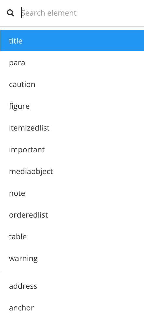
Use the Add attribute search to enter the name of the attribute or scroll through the available options.


In the image above the attribute will be added to a
paraelement . -
Select the attribute to be inserted
.Note
You can only add attributes that are valid for the selected element.
-
Give the attribute a value. Depending on the attribute type:
-
Select a menu option.
-
Enter the value manually in a text-entry field.
-
Check a box in front of a profiling value or Create Profiling Values


To the left - The attribute
widthhas a manually entered size value. To the right - The attributeaudiencehas a list of profiling values to choose from. -
-
Select Save.

-
Repeat this procedure for any other elements that need attributes.
Tip
To remove an element attribute, see Remove Attributes.
To update a profiling value for an attribute, see Add or Remove Profiling Values.
Element attributes are properties that you can add to an element, such as a section or table. There are many different attributes you can use, and you add them in the Element attributes panel (see Style with Attributes). When you add an element attribute, you also have to set its value. Typically, they have one value, but you can add multiple values when needed.
For example, if you want to use the role attribute to assign a class name to a section and also make it collapsible, you would need to add two values. In this case, "accordion" to make it collapsible and then another value for the class name.
To add multiple values:
-
Use the Element attributes panel to add an attribute to an element.
-
Enter the values in the field next to the attribute. Separate the values like this:
-
Use a semi-colon to separate values. For example, here, the role attribute is given two role values: accordion and subsection. A semi-colon is used to separate the values.
role="accordion;subsection;"

-
Use a colon to separate "keys" from values. "Keys" are properties that can have values. They are only suitable for certain attributes, such as the
styleattribute that you can give to a table element. For example:style="border-style:solid 2px;border-color:blue;"

Here, the attribute is style. The first key is border-style and it is separated from its value (solid 2px) by a colon (:). The second key is border-color and it is separated from its value (blue) by a colon (:). Each key and value pair is separated from the next by a semi-colon (;).
-
-
Select Save.
Note
Some attributes allow the space character as a separator. For example, if you add a role attribute and set its value to "specifications table", it will get two class names in HTML when it is published. In the HTML, it will appear as class="specifications table" which means "specifications" is a class and "table" is a different class.
For this reason, it is best practice to avoid using spaces inside a value that you want to become one class. For example, use "specifications-table" as this will be one class, rather than "specifications table" which will be two classes.
Each element in Paligo can have attributes, which are properties. For example, a paragraph could have a role attribute with the value "example-style" so that it can be styled differently from other paragraphs by using CSS. If an attribute is no longer needed, you can delete it.
To remove an applied attribute:
-
Select the element in the topic.
-
Place the cursor in the Element Structure Menu below the toolbar.
Note
When you select an element in the Element Structure Menu, Paligo highlights it in yellow.
-
Select the element and choose Go to element to show the attributes for this particular element.
The Element Attributes Panel. now shows the attributes for the selected element.
-
Place the cursor over the attribute in the Element Attributes Panel and select the X to remove it from the element.

-
Select Save.
Paligo is based on DocBook 5.1 and supports most of the attributes that are included in that content model. Read more about DocBook 5.1. But there are some differences to consider that Paligo:
-
Uses the
<article>element for publication topics, see Supported Info Elements. -
Uses the
<section>for topics. -
Does not support other root-level elements such as
<book>and<set>.
Caution
Paligo also supports some "internal attributes" such as xinfo:image, xinfo:resource, and xinfo:text. These "internal attributes" are created and maintained automatically by Paligo and are used for allocating
IDs to elements. You should not edit them.
Every element has a set of attributes, which are properties that define the element's characteristics. For each attribute, there is a value, and by changing the value, you can control how Paligo uses the element. Common usage areas are:
-
Filter Attributes to include or exclude content, see Filtering / Profiling and Create Profiling Values.
-
Width attributes for adjusting image sizes.
-
Role attributes for various features, including collapsible sections and adding class names to HTML, see Role Attribute Values.
 |
Above Style is the attribute and background-color:bg1 is the value.
Paligo supports the Filter Attributes as well as the following attributes:
|
Attribute |
Description |
|---|---|
|
depth |
Use on the |
|
contentdepth |
Use on the |
|
contentwidth |
Use on the |
|
continuation |
To get a continued numbering in sidebars, see Use Numbering in Sidebars. |
|
label |
Use on a topic's |
|
language |
Use on a |
|
role |
Use the role attribute with specific values to set Paligo to provide particular functionality, see Role Attribute Values |
|
scalefit |
Allows an image to be scaled up or down to fit within available space. If |
|
style |
Style the background colors for individual individual table cells ( |
|
tabstyle |
Style the |
|
width |
Use on the |
|
xinfo:appid |
Use on the The |
|
xinfo:chunk |
Use on the The |
|
xinfo:keep-together |
To control the flow of elements over two pages in PDF outputs, see Soft Page Breaks. The |
|
xinfo:keep-with-next |
To control the flow of elements over two pages in PDF outputs, see Soft Page Breaks. The |
|
xinfo:outname |
Use on the The |
|
xinfo:pagebreak |
To set a hard page break in PDF outputs, see Hard Page Breaks. The |
|
xlink:href |
To make images work as links, see Turn Images and Other Elements into Links. |
|
xlink:show |
To override the default link behavior for individual links, see Update Individual Link Behavior. |
Tip
To learn how to add an element attribute, see Attributes.
You can use the role attribute with specific values to set Paligo to provide particular functionality. There are many possibilities, including adding class names to HTML outputs, adding extra-responsive features to HTML tables and controlling wrapping in PDF output.
 |
Tip
If you already have a role attribute, separate the values with a semi-colon.
The following table shows the role attributes and values that you can use in Paligo.
|
Attribute value |
Description |
|---|---|
|
accordion |
Use to create a collapsible |
|
column-count |
Use to set the number of columns in a |
|
column-gap |
Use to set the amount of space between columns in a |
|
extra-responsive |
Use on |
|
font-size |
Use to set the size of the lettering on a verbatim element, such as |
|
<free text> |
Can be used on any element and you can enter any text as the value, for example, role: online-image. The value is used as a class name in HTML outputs. This only applies if the HTML layout is set to include the role attribute as a class name, see Classes and Attributes HTML5. |
|
img-thumbnail |
Use on |
|
img-thumbnail-reset |
Use on |
|
multi-publication-portal |
Use on |
|
notintoc |
Use on |
|
portal-category |
Use on the |
|
promoted-content |
Use on the |
|
reuse-range |
Use on |
|
swagger-topic |
Use on the
|
|
top-nav-link |
Use on the |
|
wrap-option |
Use on verbatim elements, such as |
You can use the Emphasis attribute to make the content bold, italic or underline. When adding the emphasis attribute, the text becomes italicized by default. If adding a role, the value (bold or underline) replace the default italicization.
If you want to use another emphasis when using the emphasis attribute, the solution is to use it in combination with the Toolbar buttons or Keyboard Shortcuts.
Important
You can use emphasis on text that already has an inline element, such as code. But it is important that the emphasis element is outside the inline element, for example:
<para><emphasis><code>code snippet content goes here</code></emphasis></para>
-
Highlight the text that you want to be bold, italic or underline.
-
Press Alt + Enter ⏎ (Windows) or Command ⌘ + Enter ⏎ (Mac) to display the Element Context Menu.
-
Enter
emphasisand select it.By default the text becomes italicized.
-
To make it bold or underlined, select the
emphasiselement or highlight the text that uses it.
-
Add the
roleattribute and set its value to bold or underline in the element attributes section.The italicization will be replaced with the chosen value.
-
Select Save.